A quick shot of the range / hood / fridge wall from a project that is nearing completion in Aspen. The cabinetry is Textured European Oak Veneer with a special "liming" process from Greenfield Cabinetry. Wolf range with integrated pro hood above. Door to right is a 36" fully integrated Sub Zero unit and the door on the left leads into the pantry. The stone behind the range is a translucent natural material that is backlit. Big thank you to Ruggles Mabe Studio for bringing us in on such a fantastic fun project.
sanctuary kitchen design
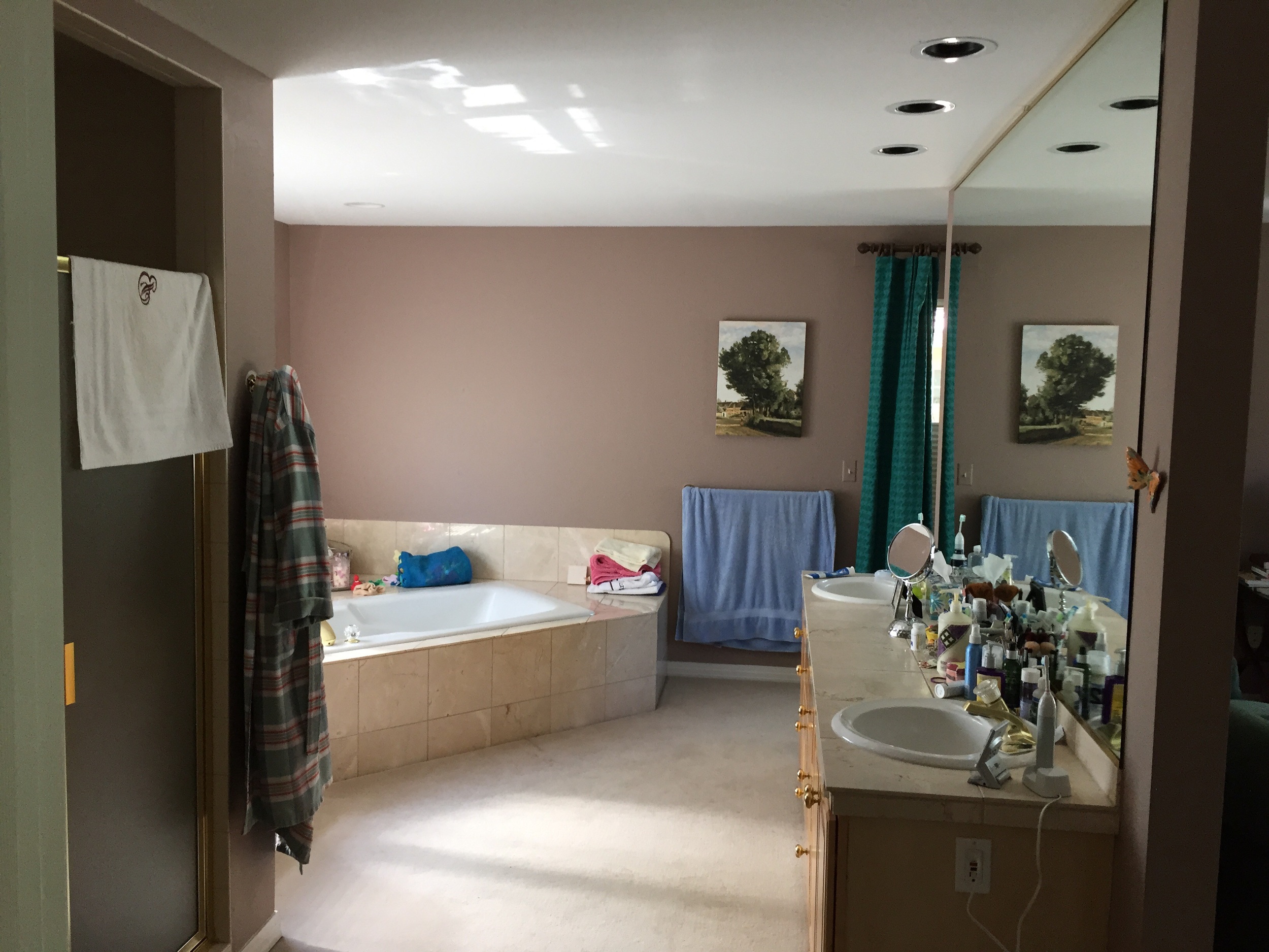
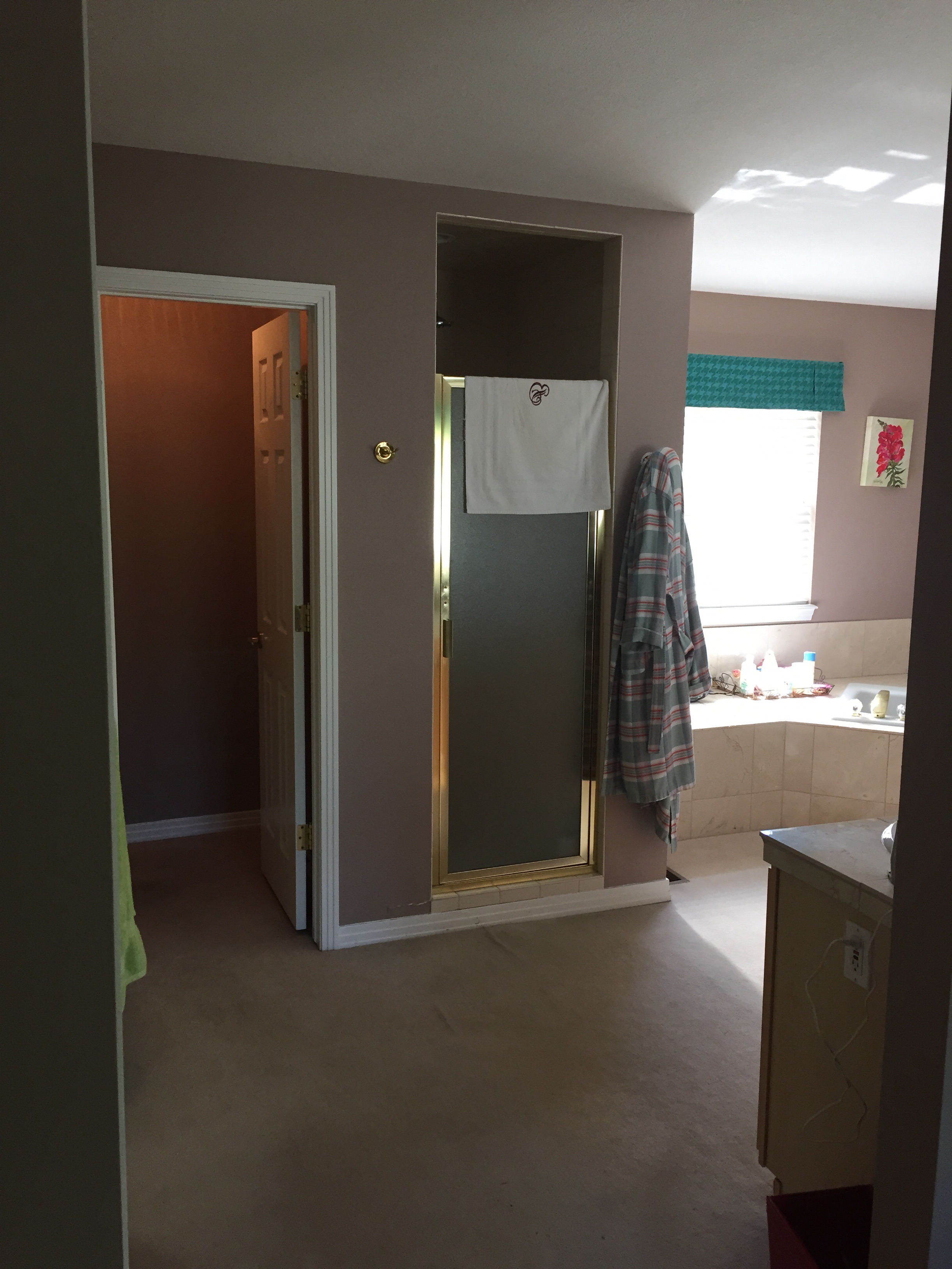
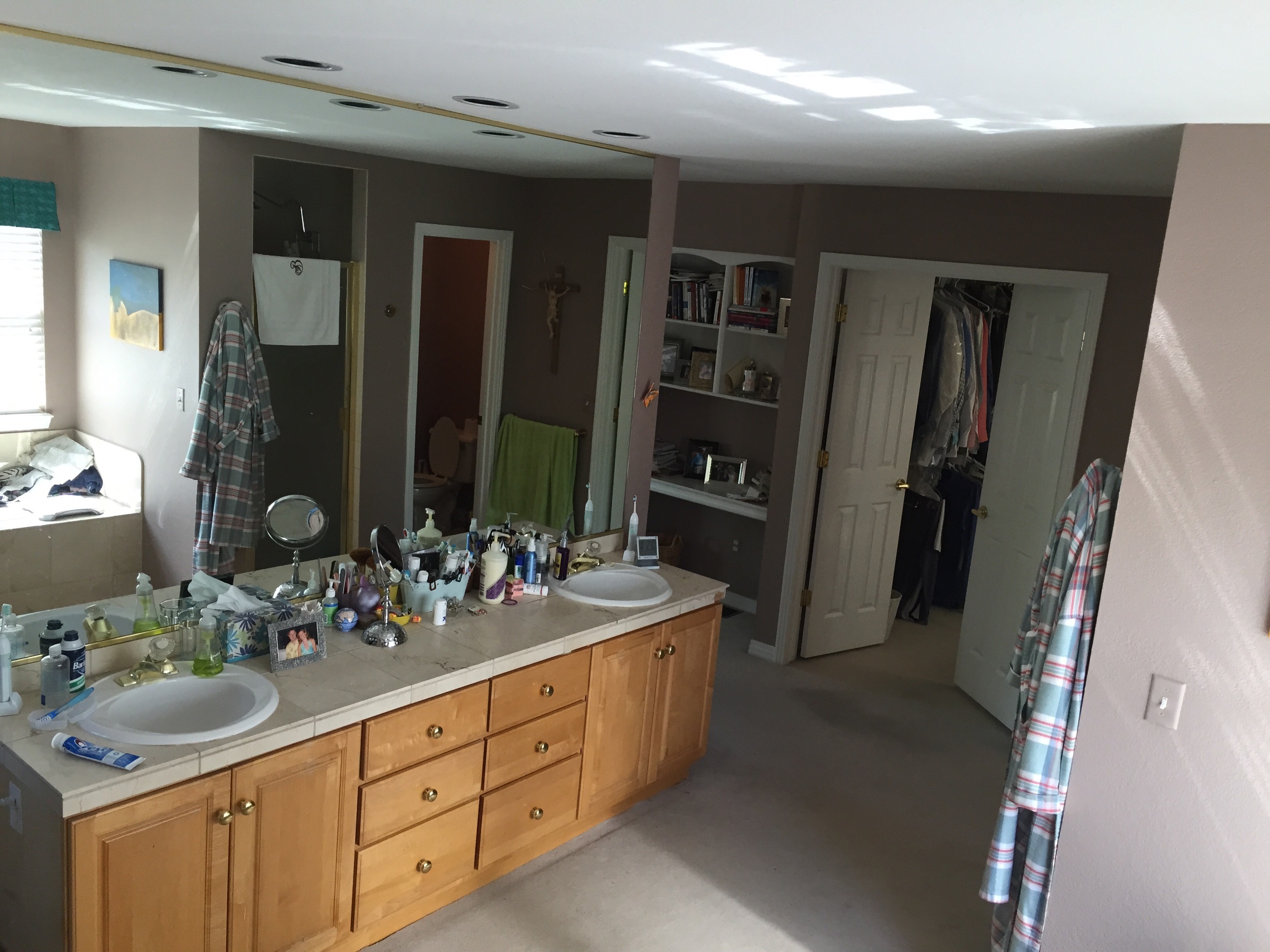
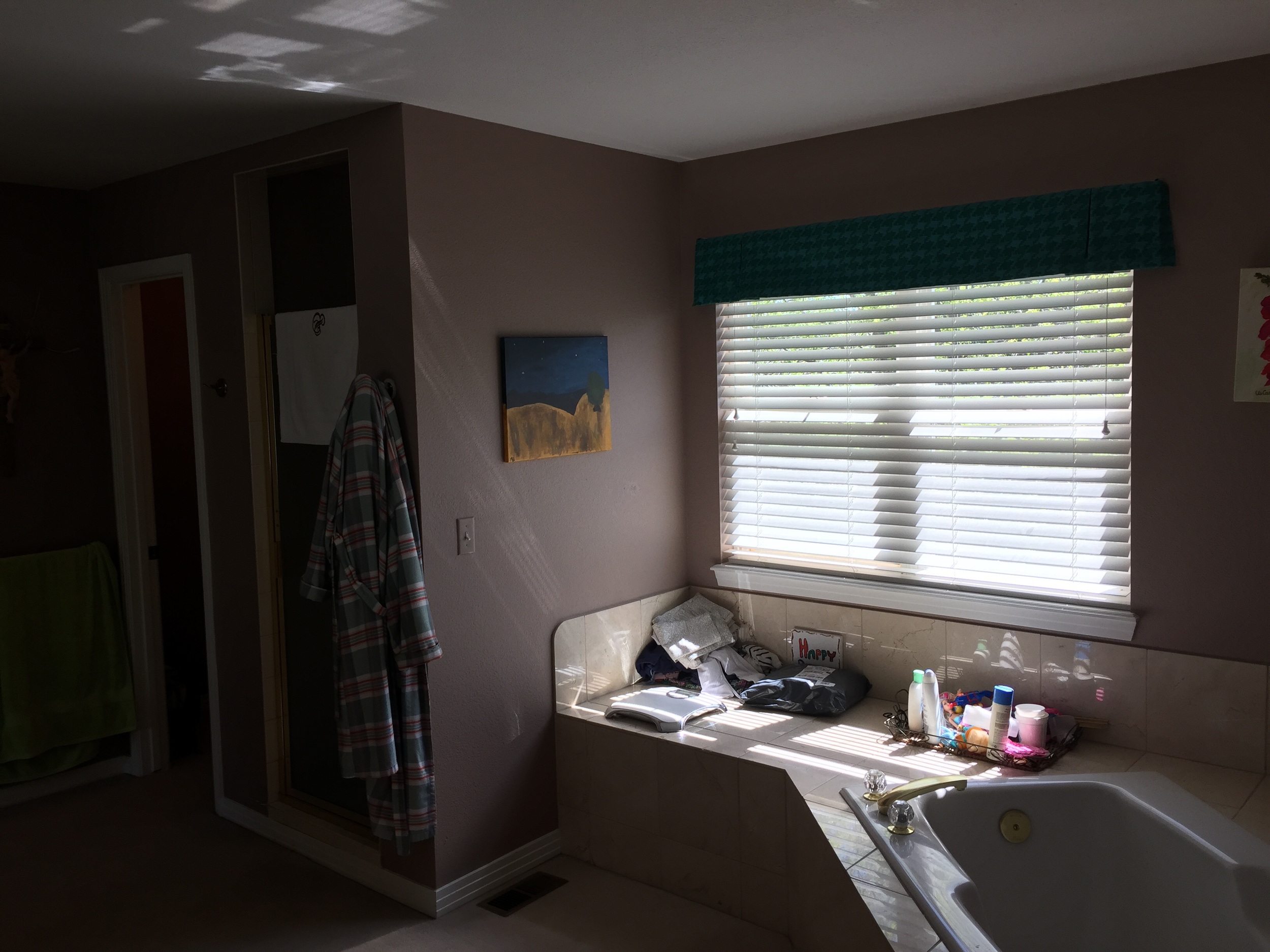
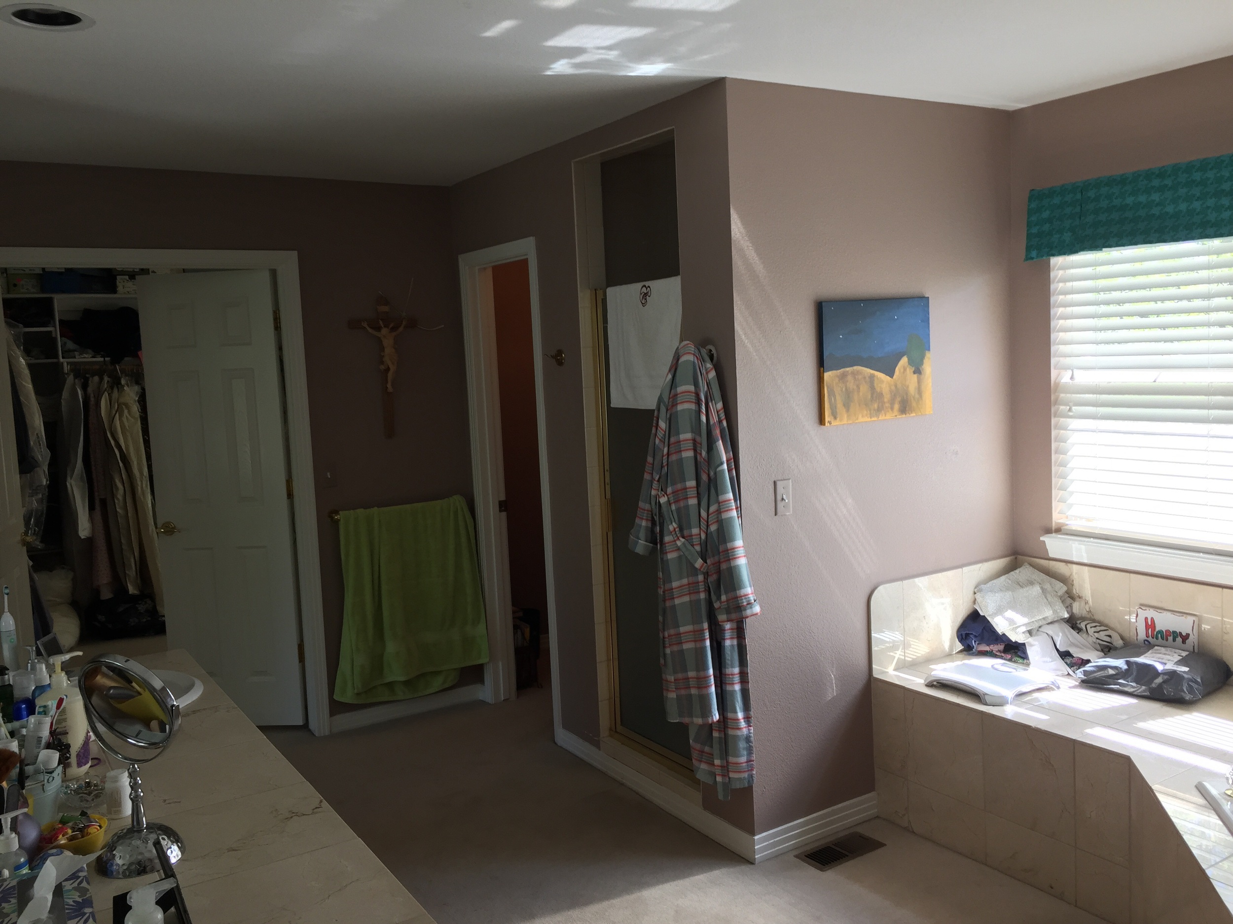
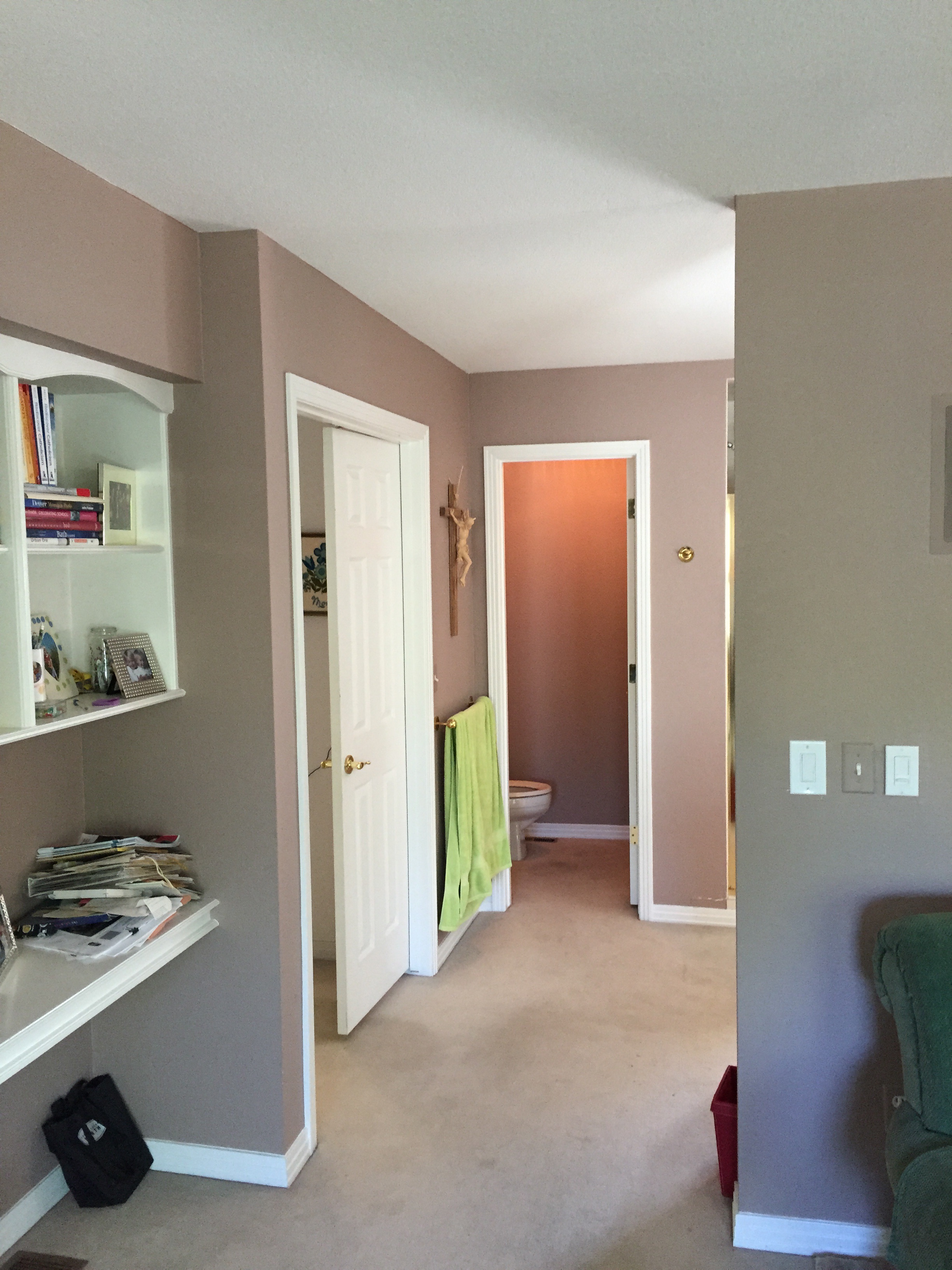
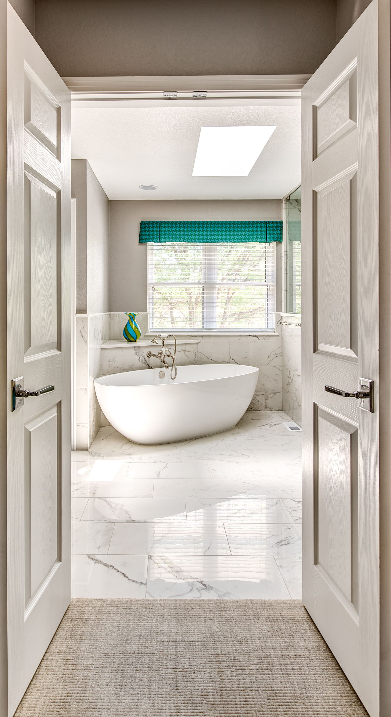
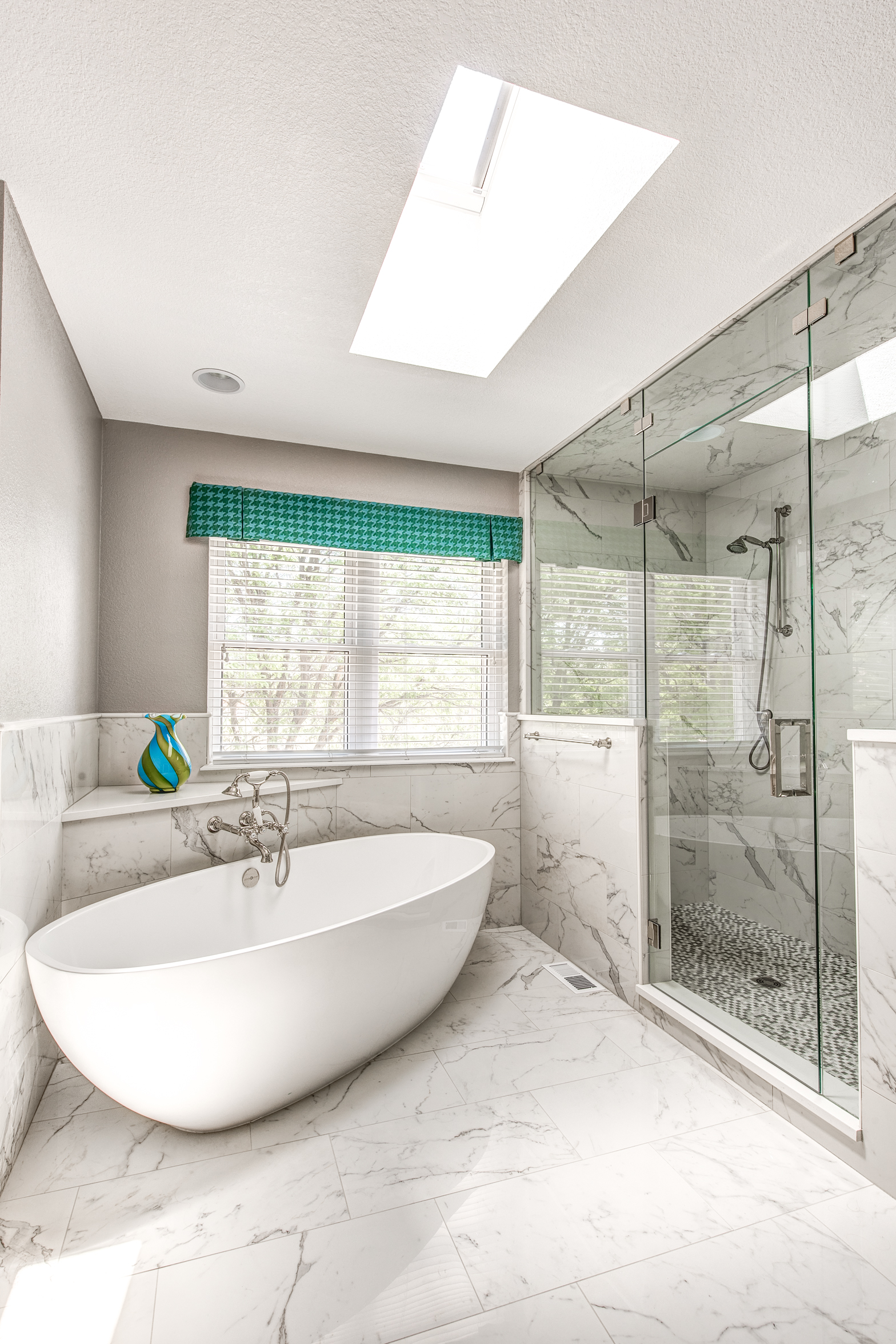
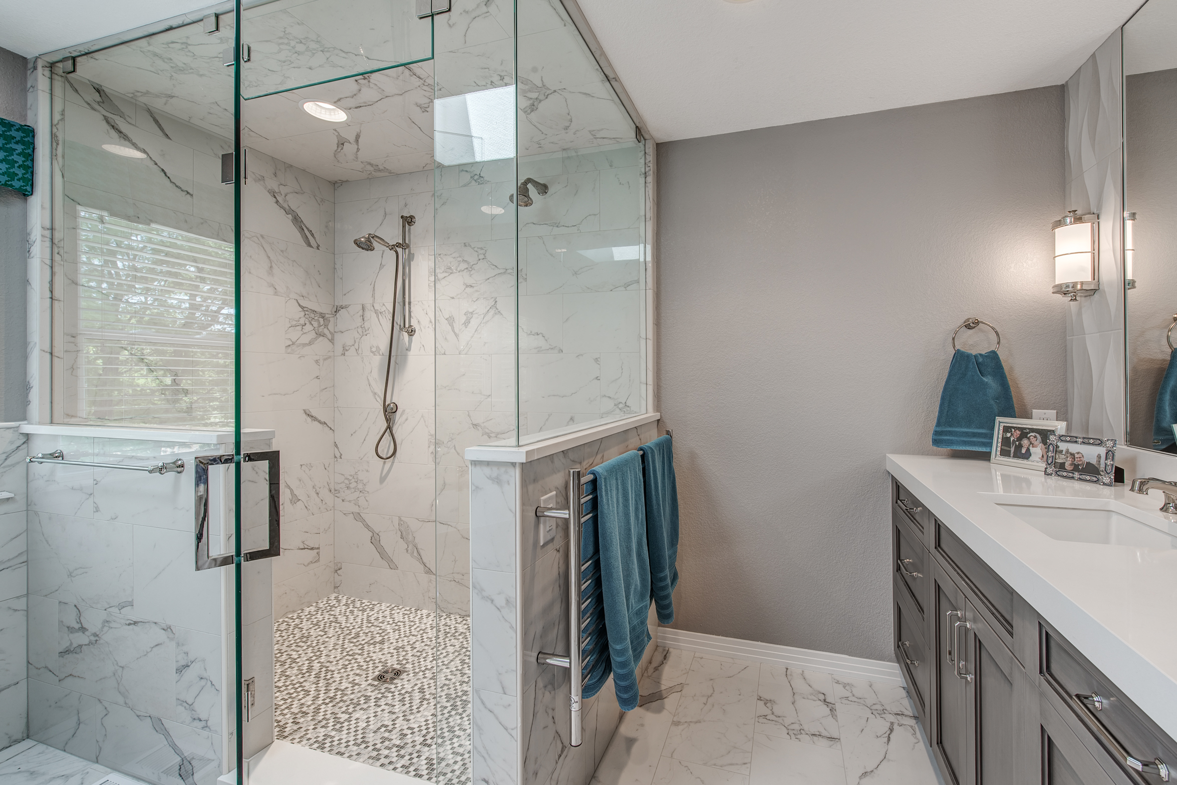
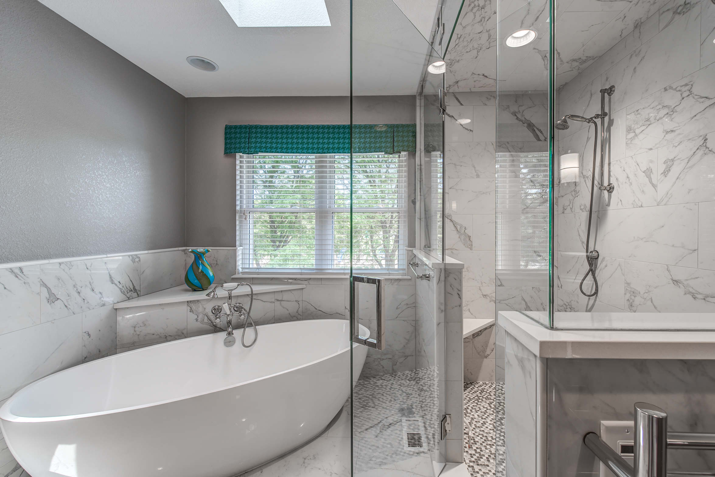
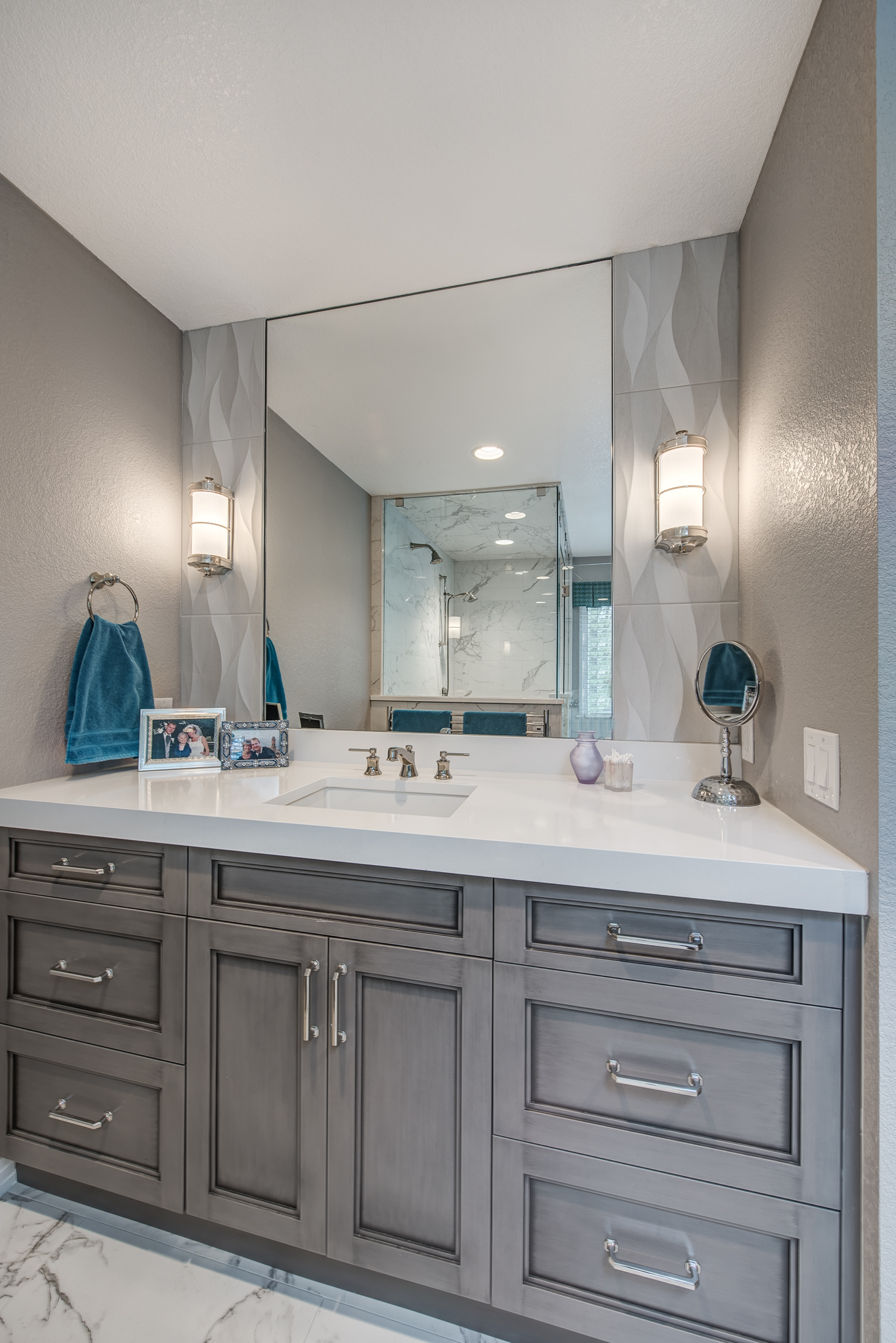
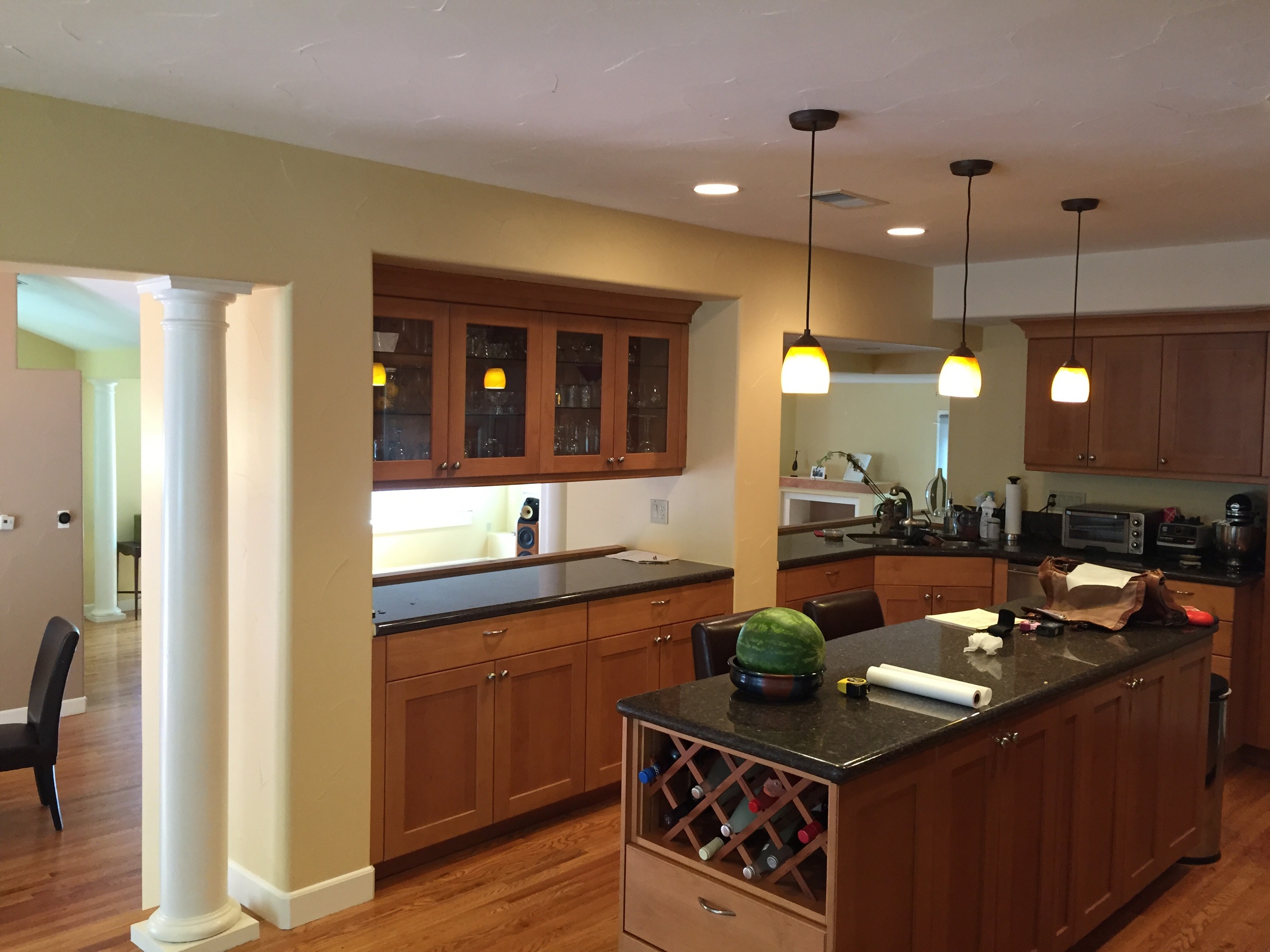
Master Bathroom Before / After
After a few concepts exploring different configurations, our homeowners decided that a free standing tub, his and hers vanities, and a spectacular shower were tops on their list.
Here are the before pictures-
Photos from the completed renovation. We relocated the shower, tub, and the entrance into the bathroom.
Following a Kitchen Remodel - Down the Home Stretch
This post encompasses weeks 7-9 of the remodel process for this particular project. To recap: we decided to completely relocate the kitchen from one part of the house to another. We moved it from a smaller space that was directly located next to the garage down to a much larger space - which was previously a living room. In addition to this - we've refinished all the flooring, redone the fireplace, and are also updating a small powder room.
Last week was really exciting! Our countertops and appliances were installed in the same day. It was quite a transformation and we certainly have to tip our cap to the general contractor who orchestrated all the trades working in one space together.
Below are some photos of custom 2" thick black walnut countertops that we had made locally here in Denver. These pieces are truly a work of art. Picture of the installation is down near the bottom of this post...
Our final post following this project will most likely not happen for a few weeks. Our general contractor is taking a much needed vacation and will be back in two weeks after a trip to Australia to finish up the last few details of this project.
Here is a shot of a custom 2" thick solid black walnut countertop that our local craftsman made for us. It's now installed as a "swing off" on the island. Picture below...
A close up shot of a "live edge" piece of walnut that will be installed as the powder room vanity top.
The kitchen is nearing completion. Next up: white backpainted tempered glass backsplash (large panels), appliance paneling, plumbing and electrical trim...
Following a Kitchen Remodel - Week 3
Although it is tough to tell, there was a lot of progress last week. The plumbers were able to successfully create new plumbing connections for the main sink, cooktop, and bar sink. This week, the electricians are in the space, roughing in all the connections necessary for the new appliances and GFCI receptacles required in the kitchen.
The flooring contractor dropped off some stain samples for our floors, which are going to be refinished starting next week. Here's a look at our cabinetry finishes along with the flooring samples. We are leaning towards the natural oak which will receive one treatment of bleach to lighten it and remove any orange / red tones. We are also specifying a water based finish to prevent any "honey" coloring over the years.
Here is the favored wood stain next to the new mudroom entry tile.
Following a Remodel from Start to Finish - Week 1
Interested in following one of our kitchen remodels from start to finish? Good! You're in luck. We're going to be posting entries here as often as possible - shooting for weekly updates - following one of our kitchen remodels in Boulder.
Today is the first entry - and I'm going to use a few photos and drawings to illustrate the old house footprint and what we aim to accomplish with the kitchen remodel.
Here is a drawing of the existing house - pre - remodel.
EXISTING FLOORPLAN
As you can see, the kitchen currently occupies the smallest room on the main level of the house.
And while the kitchen is the smallest room on the main level, the room with the most space, the lower living room, sits mostly under-utilized.
What we aim to do is completely relocate the kitchen down to the lower living room. This will take advantage of the south facing windows for great sunlight, a much larger footprint, and it will also give us the opportunity to create the "great room". Below is the proposed new floorplan for the main level:
PROPOSED NEW FLOORPLAN
And here is a 3-D rendering of what the new kitchen space will look like once completed. A mix of zebra wood veneer and high gloss white cabinetry will be topped with a white quartz countertop and a really amazing walnut top on the island. Sub Zero and Wolf appliances are complimented by the back painted white back splash. We're even incorporating a new bar into the space to create a place where our homeowners can make a drink after a day at the office.
First phase of demolition was completed yesterday. Here's our first pic of the new kitchen space, after the built ins were removed.
Demolition phase one complete!
Check back with our blog regularly to see the progress as we completely transform this home. We are aiming for weekly updates with photos and notes of our progress.
Sanctuary Kitchen Design Awarded "Best of Houzz 2016"
Sanctuary Kitchen Design is proud to have been awarded "Best of Houzz 2016" in the customer service category.
Read MoreOn the Drawing Board: Cherry Hills Kitchen
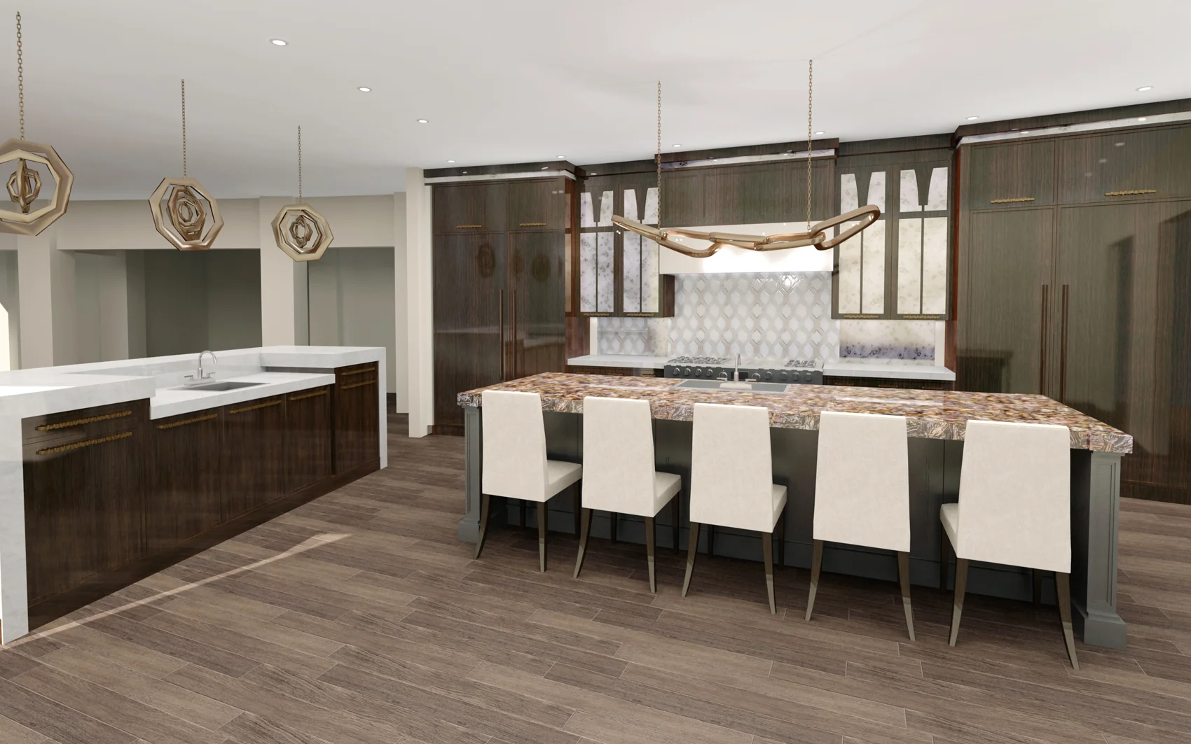
We've just completed renderings for a fantastic kitchen in Cherry Hills Village. This kitchen will be comprised of high gloss walnut, antique mirror, and brush stroke paint on the main island. We are implementing a system of hidden niche storage for the back wall of the kitchen. Once installed, these sliding doors will hide some really great functional storage for spices, oils, and other cooking items.
A Custom Shelving Unit Can Add a Lot of Interest to Your Space
This custom shelving unit was created using plumber's pipe and reclaimed boards that were found in a neighbor's back yard. We think the overall effect is really unique now that it is installed on this tiled wall. You can achieve some pretty unique looks by mixing materials that wouldn't naturally be found together. Here, we used steel, reclaimed wood, and a marble-looking tile to create an aesthetic that is eclectic and interesting.
How to Plan for In Floor Heating / Radiant Heat in Your Bath
It's one of the most asked for luxuries in a bathroom project - in fact I can't remember the last time it was not part of a major overhaul of a master bathroom. Radiant Heating, also known as in floor heating, is becoming a standard for the modern luxury bath.
Frequently asked questions about in floor heating:
1. How is it installed?
2. How is the temperature controlled?
3. Will my bathroom become too hot if I don't eliminate the existing heat registers?
4. Can I use radiant heat under my wood floors?
5. Do's and Dont's
Answers:
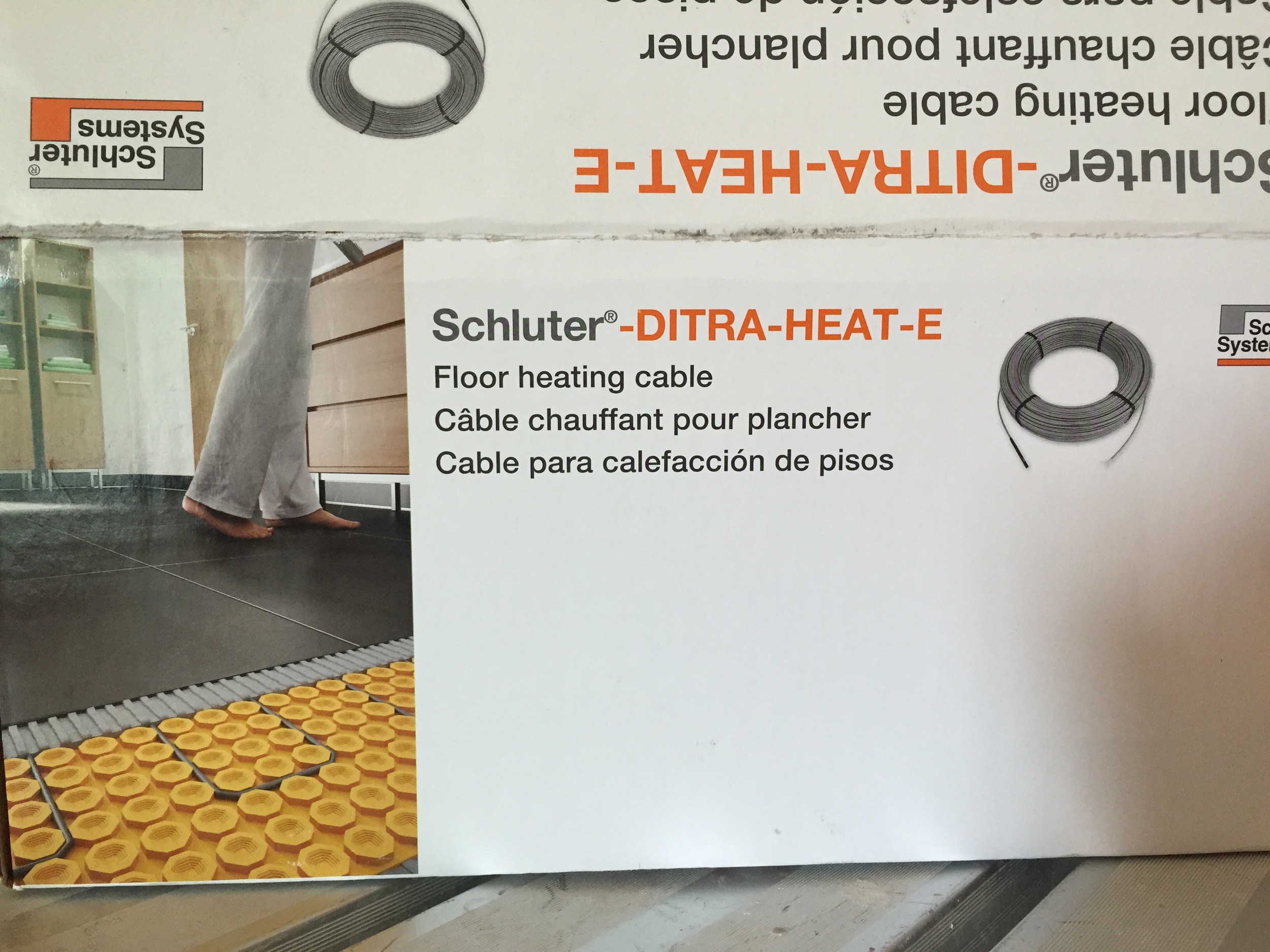
1. At it's most basic premise, radiant heat is a system that heats the floor of a room. Related to a bathroom, the preferred method is to use a self contained electric system. There are several companies that provide these systems, but my personal favorite is the Schluter Ditra.
It is a self contained electric system that comes in a single box. Tile setters perform the installation but an electrician is necessary for providing the electrical connection. Communicating the specifications and details in the early stages is very important to all sub contractors on your project.
Whether you use the Schluter system or a similar one, the installation process is fairly straight forward. These heating systems come in "mats". The wires are either embedded in the mats or they are laid directly into the mats (as with the Schluter).
The Schluter Dietra System is a mat and wire system. First the mat is laid, and then the wires are placed at specific intervals for the areas that heating is desired. In this system, you can dictate which areas receive heat and which do not.
Whether you are using a pre-sized heat mat or the system noted above, it is laid on top of thinset above the sub flooring. Another layer of thinset is applied on top of the mat when the tile is installed.
2. The temperature is controlled by a thermostat that is placed on the wall. Thermostats are now fully programmable, meaning you can have your heated floor turn on to a certain temperature at a specific time and then turn off after a specified time period. So if a couple usually wakes up at 7AM, they can set the thermostat to reach a certain temperature by 6:55AM setting the floors to a perfect temperature before anyone ever steps foot into the room. After the usual routine of bathing and grooming, the floors return to a "dormant" state, and the heat is turned off. You can repeat this process several times during the day if needed.
3. Each house is different, so assessing the current heating situation is vital prior to planning for radiant heat. However, in most cases, radiant heat is sufficient for heating an entire room and no additional heat registers are necessary.
4. Always check with the manufacturer of the flooring as to its compatibility with radiant heat. Dependent upon the wood species, climate, and installation you should be able to utilize radiant heat under wooden floors. Generally speaking, engineered hardwoods perform best.
5. Do: lay radiant heat under areas in front of each vanity sink, in front of the toilet, and around bathtubs. Dont's: Do not lay radiant heat under the footprint of a cabinet, bathtub, or toilet. Laying radiant heat under a toilet will cause the wax ring to melt and become a big issue in the future.
The cost of radiant heat has come down dramatically over the past few years. An installation can be completed in a day and the units themselves are not terribly expensive. Radiant heat has become one of the most popular add on items to a master bath remodel with good reason. Who wants to stand on cold tile first thing in the morning?
In the Press
Sanctuary Kitchen and Bath Design featured in the April 2015 issue of Colorado Homes and Lifestyles.
Click HERE to view a PDF version of the article.
On the Drawing Board...
What you are looking at is not a photograph! This is a rendering of an arts and crafts style kitchen that we have been working on for a few months. I find that the rendering medium is an extremely powerful tool for communicating designs to clients prior to signing off. This particular kitchen will be new construction in the Park Hill neighborhood of Denver.
Sanctuary Kitchen Design Featured in Current Issue of Kitchen and Bath Ideas!
This bathroom seems to be a crowd favorite! It is featured in the winter issue of Kitchen and Bath Ideas by Better Homes and Gardens. Unfortunately, I cannot link to a digital version of the article, as the publication does not offer their content online for free. However! You can purchase this on newsstands NATIONWIDE until March 9. Here's a link to purchase a copy online : http://bhgspecials.zinio.com/browse/publications/index.jsp?productId=500622041
New Projects - Winter 2014/2015
I'm very excited about the projects on the drawing board at the moment. It will be a busy winter!
Hilltop Neighborhood Denver - Ground has finally been broken on our new build in Hilltop! My clients are a young family of three and they are building a house to live in and raise their family. I am very excited about designing their kitchen and bathrooms. We will be calling upon the white kitchen to anchor the great room on the main floor of this house, and it will be an amazing, comfortable, warm space when I am finished with it. Drawings are underway and I'm happy to say that I'll have some 3-D renderings of this space before too long to show you.
Secondly, but happening much sooner, is a remodel just up the street from the new home I mentioned earlier. I'm pleased to announce that we will begin work on a major remodel on a home just acquired by a wonderful family of four that recently relocated from another major city. This project will entail new walnut flooring throughout the second floor of the home and a major overhaul of the basement which will include a home movie theater, new bar, billiard table area, home fitness gym, and children's arts and crafts room. We're moving fast on this one and are hoping for a January completion.
Boulder - work continues on our condo remodel on Pearl Street. As we enter the construction phase of the project, I will keep you updated with quick pics of the progress.
Also in Boulder - another great young family has retained me to redesign their second floor master suite area. Plans call for a complete overhaul of the function of this second level of their home. I am planning for a spectacular master bath retreat complete with free standing tub and custom shower. We're also going to add a laundry room to the second floor and refinish the existing guest bathroom as part of the scope of work.
My third project in Boulder for this winter entails a very similar scope of work in redesigning an existing second level in a home to better fit the lifestyle of the hard working couple that owns the house. I will be working with Melton Design Build again on this project to create a space that works both functionally and aesthetically.
Bonnie Brae Neighborhood, Denver - We will make some minor alterations to the office and master bathroom of this home in the short term. Longer term - an addition is in the design phase to connect a detached garage to the main portion of the home. I will be working with the homeowners to design an interior layout that best maximizes the use of this new space. Funny story: This will be my second time working on this exact home, but now with different owners!
Fort Collins - I've recently been retained to redesign a kitchen in an absolutely beautiful home. The kitchen has obviously been taken care of over the years, but it is in desperate need of a major remodel. We will be knocking down walls and annexing space from a seldom used formal dining area to create a space that is comfortable, functional, and beautiful.
I promise to keep you updated on the slate of projects on the drawing board as work progresses. It will be an exciting winter with a lot of great designs happening!
Scouting Shots of a White Transitional Kitchen
So you'll notice right off the bat that these are not the highest quality photographs. That's because I took them myself with my phone camera. So please forgive the quality! I posted a few pics earlier this fall of this kitchen in various stages of installation, so hopefully this will tie it all together and you'll get an idea of what the space turned out like.
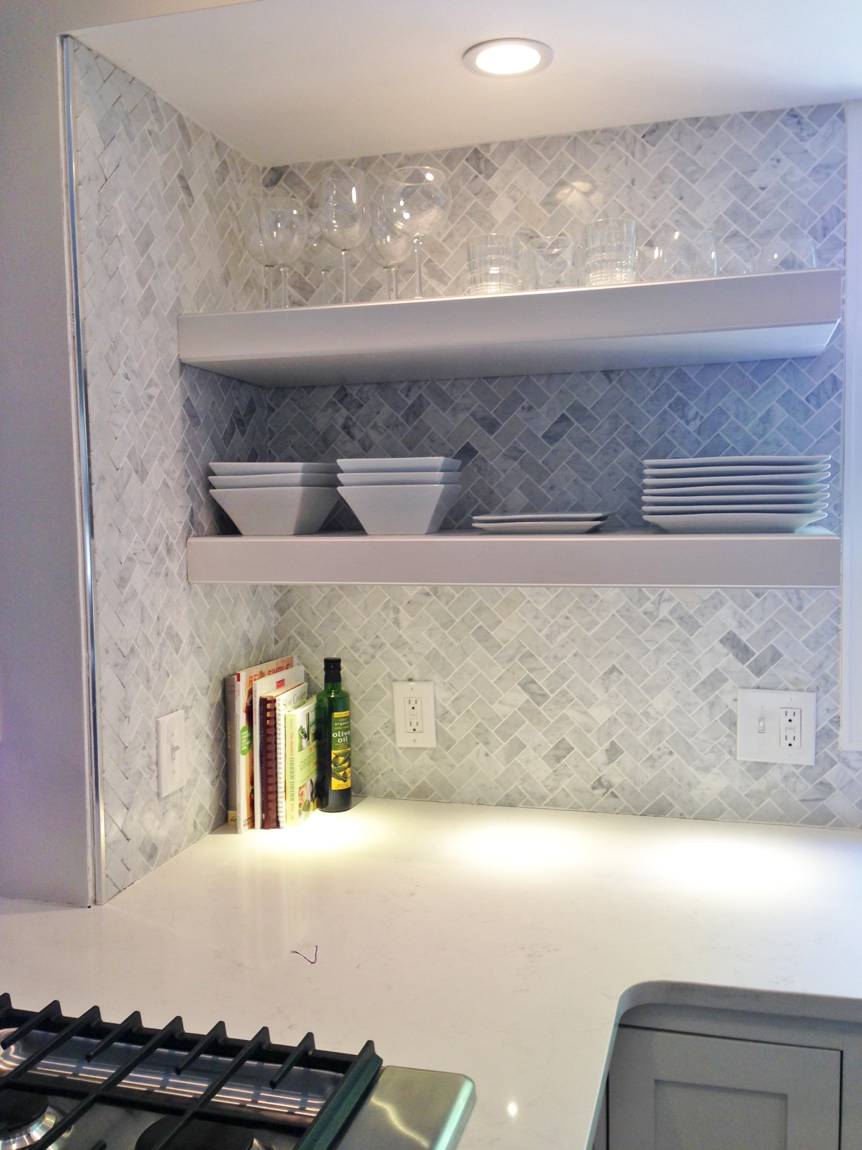
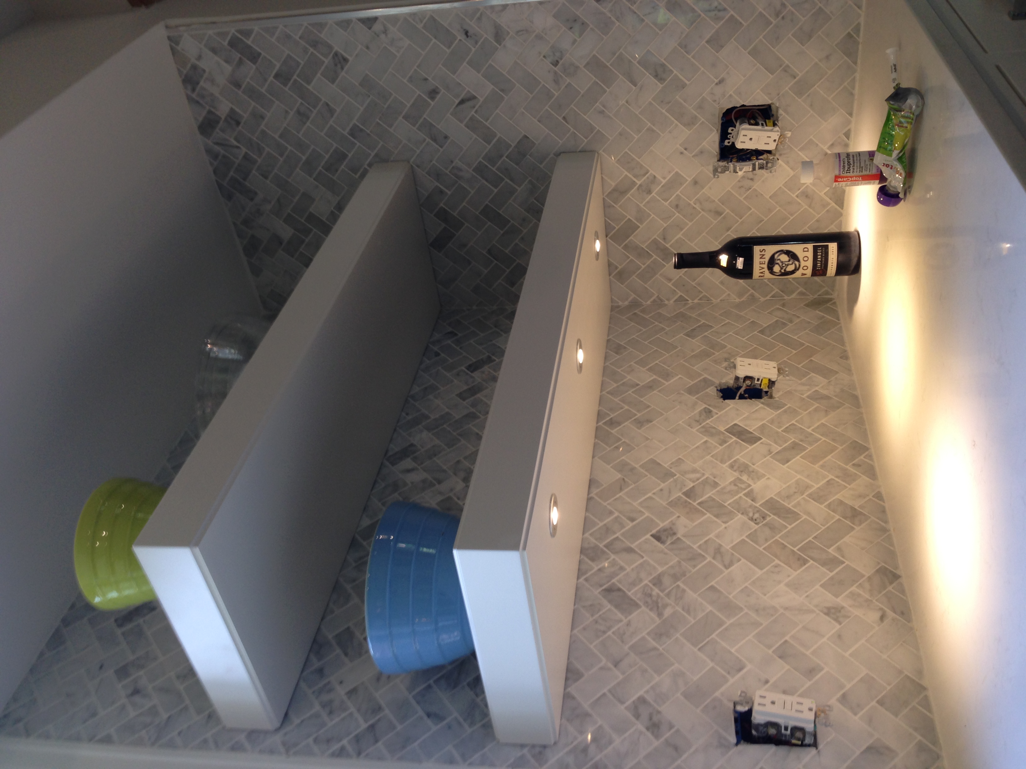
The defining feature of the kitchen is definitely the sink wall facing out onto the back yard. We were unable to remove a soffit due to structural beams in the ceiling, so instead, we tiled the whole wall with herringbone mosaic carrara marble and the installed 3" thick floating shelves with LED puck lights.
Another feature in this kitchen that is a bit unusual is the use of reclaimed Wyoming dairy barn wood for accent pieces on the back of the island and peninsula. The gray tones work really well with the carrara marble and Caesarstone countertops. I also really pushed for the waterfall edges on the ends of the island, and I am so glad the homeowners decided to go for it.
The floating shelves are 3" thick and have a small detail on the top and bottom edge. I used 2-1/4" LED puck lights (3 on each side) as undercabinet lighting. The pucks are aesthetically pleasing and provide for valuable light on the countertop surface, which is Frosty Carrina, by Caesarstone.
Before / After Bathroom Photos of a Pool House in Cherry Hills Village
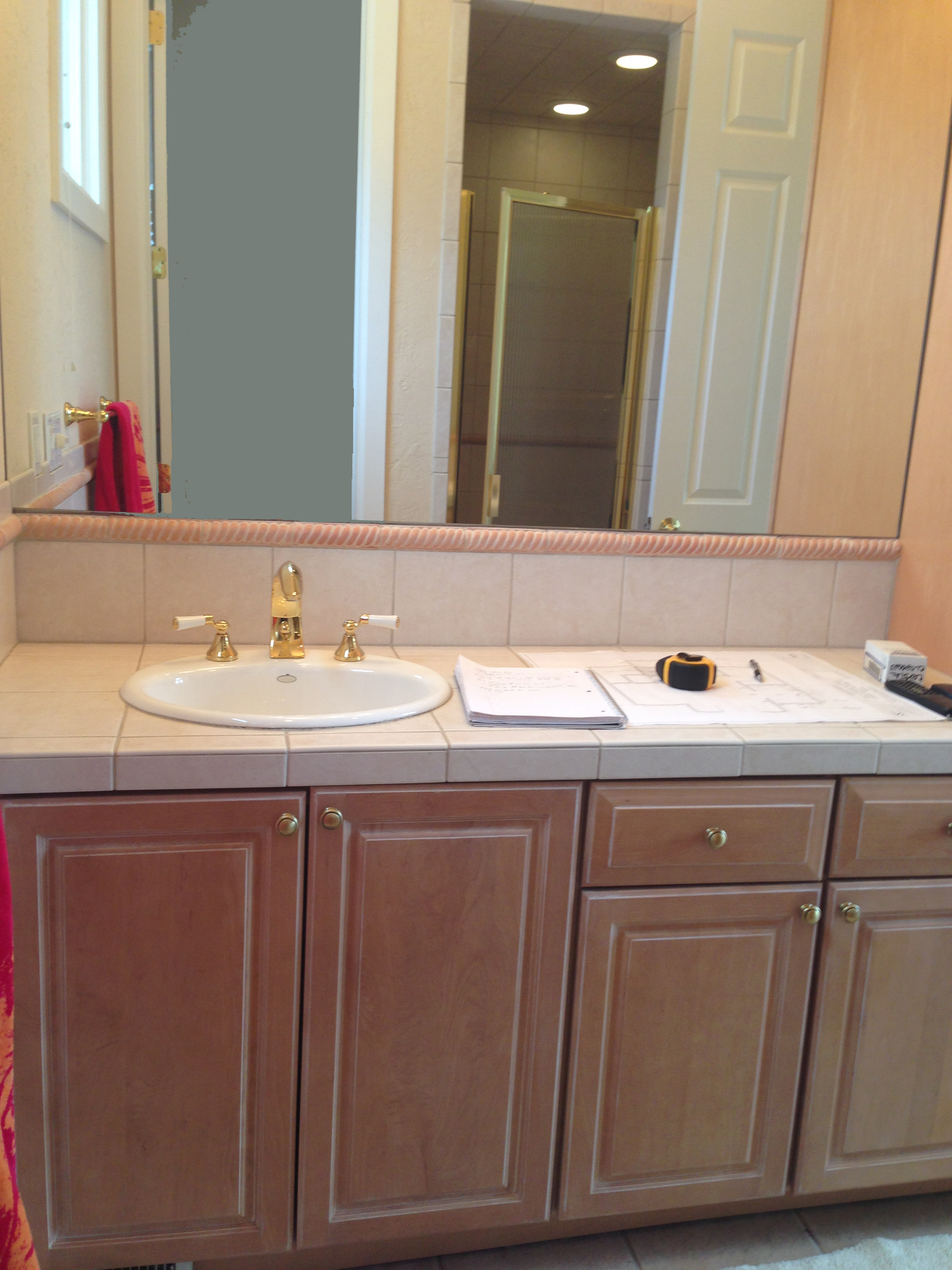
This bathroom is inside a great pool house in Cherry Hills Village. We had to work around the existing tile flooring, which isn't great. It's sort of a peach / pink color. The previous homeowners painted the walls a flesh tone, which did not help. Working with BOA Construction, I designed a new bathroom for the pool house using Porcelanosa wainscot tile, a custom 8" thick concrete countertop with trough sink, and a custom vanity with polished chrome inlays on the legs.
Having to work around the existing flooring was a challenge. However, the material and color choices made during the design process dramatically cut down on the pinkish hue that was previously there.
Here are the before / after shots!
The vanity is designed with an open shelf bottom, to store rolled-up towels for guests. Four drawers provide nice storage. The legs are 4" in diameter and have polished chrome inlays running from top to bottom. My favorite part of this piece is the 8" thick concrete countertop that rests on top of the vanity. It has an integrated trough sink. Brizo Virage Faucet and sconces.
Polished chrome accents with white paint finish and black concrete is a great combination.
The wall tile is from Porcelanosa. It's a Spanish company that imports to the US, and they carry some amazing product. This particular tile is porcelain and it is manufactured with a matte finish wood grain. We installed the 12x24 tiles horizontally on the walls throughout the bathroom with a polished chrome accent piece on top. The effect is very light and airy and it creates a "beach" feel; perfect for a pool house.
This picture shows what a "trough" sink refers to. The sink is cast as part of the mold in the concrete fabrication process. Very clean and elegant.
I updated the fireplace with the same tile we used for wainscot in the bathroom. Both vertical corners are adorned with Porcelanosa corner trim in polished chrome.
Before Photos:
New Projects for Fall / Winter 2014
New projects for Fall / Winter 2014
Read MoreHere are 15 Ways to Add Really Functional Storage to Your New Kitchen
If you haven't checked out Houzz.com yet and you are planning on remodeling or building a new home....go there now! It is stocked full of great ideas for those of us that love design, architecture, and construction.
Click on the link below to read an article that highlights some unique ways to add functional storage to your kitchen.
Planning for Switches and Outlets in Your Kitchen Design
It is quite easy to overlook the placement of GFCI receptacles (outlets) and light switches in your kitchen design. We use these items so often that they become an oversight because they're always just "there" when you need them. However, somebody had to think about where to put that light switch or that GFCI outlet. It didn't just appear there...
I use a few simple guidelines for switch and outlet placement when designing my clients' spaces. Simply spending a few minutes in the design phase to lay out these items can make a big difference in the overall function of a finished space.
Outlet Specification and Placement
Have you ever heard of a "decora" style switch or receptacle but were unsure of what it meant? It refers to a line of outlets and switches manufactured by Leviton. The "rocker-style" switches and square styled receptacles look more modern and have more features than the old school style of outlets, so they are preferred by most homeowners.
Each municipality has its own requirements and codes for the placement of GFCI receptacles in the kitchen. So you'll need to ask your electrician what the exact distances are for your town. However, I can tell you that in its most general sense, you will need GFCI receptacles in the following locations in every kitchen:
- Within approximately 2 feet of the outside edge of any sink located along a wall
- On an island: one receptacle on each end of the island
- On a peninsula: one receptacle on the end of the peninsula
- On the kitchen walls: one receptacle every 2 feet (approximate. Again, check with your electrician for the exact dimensions required by your town's codes)
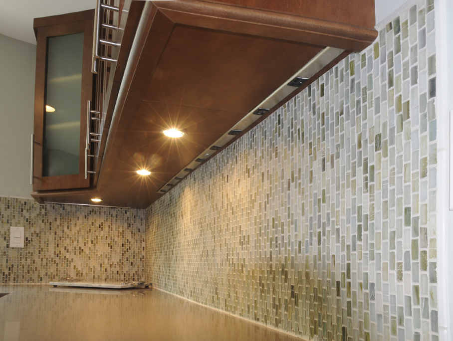
If you don't want to see GFCI receptacles in your kitchen backsplash, you can also use what's called "plug mold". Plug mold is more costly than standard outlets and more difficult to plan for and install, but it's very convenient and it completely hides your required outlets up under the wall cabinets.
Plug mold is a great alternative to standard outlets in the kitchen backsplash. There are several manufacturers of plug mold.
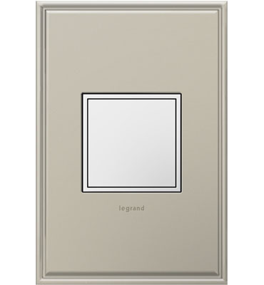
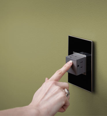
Another option I love for new kitchen outlets is the new Adorne line of receptacles and switches by Legrand.
The pop out outlet from Legrand is a great look in every kitchen
Outlets are a necessary eye-sore in every room, but most important in the kitchen. When planning your kitchen outlets, think about where you will place your small countertop appliances and where you'd like to have them plugged in. When in doubt, add an outlet.
You'll also want to think about where you'll charge your phone, tablet, and other mobile devices. When space allows, I always plan for a charging station in the kitchen. Not every kitchen has the room for it, but most do. Having a spot to charge your devices away from where food preparation occurs is a very nice thing. So don't forget to think about that aspect as well.
Switch Placement in the Kitchen
When laying out the switch placement in a kitchen, I always start by looking at the traffic patterns of the space. Most kitchens have 2 main entrances, sometimes three. I will identify those spots and locate my switches for the main ceiling lighting (most of the time it's the recessed cans) in a spot where they are easily accessed by those entrances. I almost always specify dimmers for the main can lighting.
The undercabinet lighting is usually switched somewhere in the kitchen backsplash. It is helpful to label the switches so that guests know what they're looking for when trying to turn on lights.
Accent lighting can be switched almost anywhere. (Accent lighting refers to the interior cabinet lights, or perhaps downlighting under the toekick). Just make sure you think about it before the electrician shows up and decides for himself where it should go without consulting you first!
Whisper Switch from Legrand
The main guidelines to follow are below. Sometimes, giving an unglamorous subject (such as switches and outlets) just a few minutes of thought is all it takes to really save yourself some major headaches down the road!
- Ensure that all GFCI requirements are met in your kitchen. This means you will need outlets near the sinks, on the ends of the island or peninsula, and also above any courter surface - in the wall.
- Think about what sort of receptacles you want to see. Are you OK with the old style outlets and switches? Or would you prefer to spend a little more and get some modern outlets that have a better look?
- Identify the major entrances / exits to the kitchen. Place switches for the main ceiling lighting at these locations. Use a three way switch that will allow you to operate the lights from more than one entrance for best convenience. Identify which lights should have dimmers and communicate to electrician.
- The switch placement for undercabinet or accent lighting can be placed anywhere you choose. However, ensure that you think about this prior to the work being commenced.
- Spend a little bit of time thinking about what sort of phones or tablets you might want to keep in the kitchen and where you will charge them. Do you want an exposed countertop area where your devices will be out in the open for everyone to see? Or would you prefer to hide them behind doors? Both of these options are available to you, it is really a matter of deciding which you prefer early in the design process and then planning accordingly.
7 Ways to Enjoy Your Kitchen Remodeling Experience
It's been a little over four years since I wrote, "8 Steps for a Successful Kitchen Remodel". I received a lot of positive feedback about it. That article was meant to provide a very basic look at what to expect during a kitchen (or bathroom) remodel. There is a lot of information pertaining to expectations, responsibilities, and order of events. So if you have never remodeled before - OR perhaps you just want to find out a little bit about my process, click on that link above to access that article.
This post is more geared towards providing some positive insights into how you and your family can not only survive, but ENJOY your remodeling experience. There is a misconception that every remodel has to be a stressful, drawn out process with absolutely no joy in it. And while ripping out your kitchen (or bath) can be anxiety-inducing; it shouldn't keep you up at night.
7 Ways to Enjoy Your Kitchen Remodeling Experience
1. Document everything with the idea that you will create a picture book about the experience once complete. Check out www.mypublisher.com, or you can use the iPhoto Print Services online if you are an Apple junky like me. Take detailed before pictures. Try to take photos of every conceivable angle and if you can, envision where the most dramatic view points will be when the project is complete. Taking a shot every single day isn't totally necessary, but I always take a quick photo of the major progress items, (cabinets, countertops, appliances, etc...) Take the "after" shots keeping in mind where you took your "before" shots. If you can stand in the same location-even better! Put the before/after shots side by side for a dramatic effect. This documentary of the progress of work can be really fun to look through a year or two after completion.
Well planned out temp kitchens make life much nicer for you when your real kitchen is ripped apart.
2. Plan your temporary kitchen space ahead of time. So important! Here's what you'll need:
- Cooking Appliances: For about $50-$100 you can buy a couple of electric or induction table top burners that plug into a regular outlet. In addition to your burners, set up a small microwave in a convenient location. You'll use the microwave a LOT over the next few months.
- 6 foot folding table. If you have room for two of these, even better. You'll need a surface for your table top burners, microwave, etc.
- Trash can
- Disposable dinnerware. I know it is wasteful, but you're not a terrible person if you use disposable plates and forks for a few months. There are several options that are recyclable as well. Try to minimize the dishes you have to do after your meals.
- Get a bus box from a restaurant supply store. Use it as as catch-all for dirty dishes.
3. Plan Dinners with Friends You Haven't Seen in a While. How long have you been planning to have dinner with that couple you love but haven't seen in 6 months? In fact, how many friends do you need to catch up with? If you are like me, then it's probably quite a few. What better way to get away from the construction zone AND get a free dinner than going over to your friend's house??? You'll have some fantastic conversation topics to talk about over dinner. It's OK to have an extra glass of wine too. You deserve it after living through this remodel...
4. Take Weekend Excursions. What? Go on a vacation during a remodel? Well, a lot of us can't afford to take a big vacation while simultaneously paying for a big kitchen renovation. For those of you that CAN - this is the best way to survive in style. I hear Cabo is great this time of year...But for those of us that need to be a little bit more frugal during the renovation, taking a weekend excursion to that mountain town you haven't explored is a great way to get away. Go camping, take a trip to see relatives. In short - just get out and do something that requires you to stop thinking about what type of granite you should decide on for one weekend!
5. Watch a Tradesmen Do His (or her) Work for About 30 Minutes. Most tradesmen would probably be cool with you taking an interest in their job. This tip is not for everyone. But for those of you that are interested in residential construction, it is a great way to learn something new while also getting on the good side of your subcontractors.
6. Use the Grill! The grill is still my favorite cooking surface. My family grills year round. Yep. Not uncommon to see me in boot deep snow firing up the grill in January. A) minimal clean up, B) great flavor, C) large cooking surface. Have a BBQ & tell your friends to bring a side. You can cook anything on the grill and show off the progress of your kitchen renovation to everyone.
7. Create a Time Capsule with Your Children. It's amazing what you pull out of old houses during a renovation. 50 year old newspapers, family photos, etc. Well, why not leave a little something for the next family that lives in your home and decides to remodel? Kids will probably really enjoy this exercise (unless they're teenagers, in which case they probably hate everything). Ask them to grab one or two small items or photographs. Add a current newspaper article or this month's 5280 Magazine. Stuff it all into a mason jar and maybe include a nice note wishing the next homeowners luck. You might stuff it into the new wall you're framing out or perhaps put it in the crawlspace in a corner where nobody will find it for a very long time. Either way, it will be fun for your next homeowners.
Scouting Shots from a Modern Project in Boulder
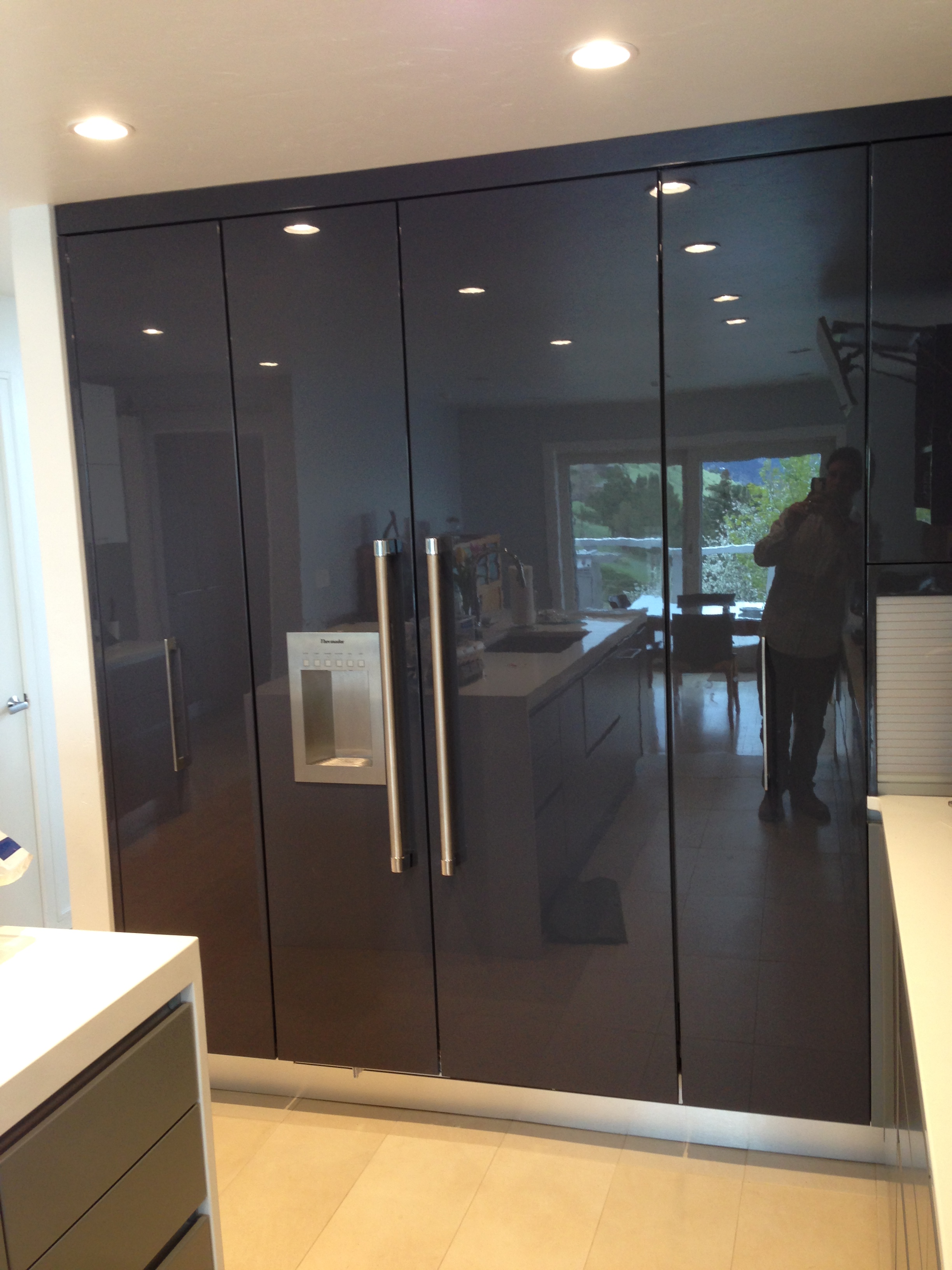
This European-inspired kitchen is truly one of a kind. The high gloss finish was actually created using the same process that car detailers use to get a reflective shine out of automobiles. The color is called Gauntlet Gray from Sherwin Williams. We really liked it because it actually reads a bit lavender once sprayed on the cabinets.
The high gloss cabinetry is contrasted by pure white Caesarstone countertops (Blizzard 2141) and a matte gray finish for all the base cabinets
Channel construction eliminated the need for any hardware below the countertops...
Base cabinetry - metal channel construction eliminates need for hardware
So as you can see the hood is not installed and the backsplash is also yet to be installed. Here's a picture of the tile that will be used in conjunction with a 12x36 pure white tile on the splash.
The marble accents in this mosaic should provide some warmth and implied texture to the kitchen...
I also designed some refined cabinetry for the pantry. It's minimalistic by design and provides tons of storage for coats, cleaning supplies, cook books, and more.
The pantry provides functional storage and keeps mops, brooms, and coats out of sight.
I specified all opaque white glass doors for the wall cabinetry. Blum Aventos hinges provide a "wow factor" when opening and closing the cabinets.
The lift up hinges are super silky.


