denver kitchen design
Sanctuary Kitchen Design Featured on Houzz.com
A few months ago, we were contacted for content regarding how to discuss budget with customers by Houzz.com. We were happy to oblige, and the article went live today!
Click link below for the whole article:
Chic Modern Mountain
A quick shot of the range / hood / fridge wall from a project that is nearing completion in Aspen. The cabinetry is Textured European Oak Veneer with a special "liming" process from Greenfield Cabinetry. Wolf range with integrated pro hood above. Door to right is a 36" fully integrated Sub Zero unit and the door on the left leads into the pantry. The stone behind the range is a translucent natural material that is backlit. Big thank you to Ruggles Mabe Studio for bringing us in on such a fantastic fun project.
Following a Kitchen Remodel - Week 3
Although it is tough to tell, there was a lot of progress last week. The plumbers were able to successfully create new plumbing connections for the main sink, cooktop, and bar sink. This week, the electricians are in the space, roughing in all the connections necessary for the new appliances and GFCI receptacles required in the kitchen.
The flooring contractor dropped off some stain samples for our floors, which are going to be refinished starting next week. Here's a look at our cabinetry finishes along with the flooring samples. We are leaning towards the natural oak which will receive one treatment of bleach to lighten it and remove any orange / red tones. We are also specifying a water based finish to prevent any "honey" coloring over the years.
Here is the favored wood stain next to the new mudroom entry tile.
Sanctuary Kitchen Design Awarded "Best of Houzz 2016"
Sanctuary Kitchen Design is proud to have been awarded "Best of Houzz 2016" in the customer service category.
Read MoreNew Projects for Fall / Winter 2014
New projects for Fall / Winter 2014
Read MoreDenver Polo Club Kitchen by Chris Awadalla featured in 5280 Home Magazine Autumn 2014 Issue
I was happy to design the kitchen for this project by interior designer Megan Kane in Denver's Polo Club neighborhood, just south of Cherry Creek. Jones Custom Builders did a wonderful job, as always, implementing the great design with amazing craftsmanship.
Click below for full article!
http://www.5280.com/dwell/magazine/2014/08/hit-refresh
Progress of Our White Transitional Kitchen Remodel in Boulder
This transitional white kitchen is shaping up to be a proper space. My clients have been incredibly great to work with, so I am excited about the fact that they will be using this kitchen in a few short weeks.
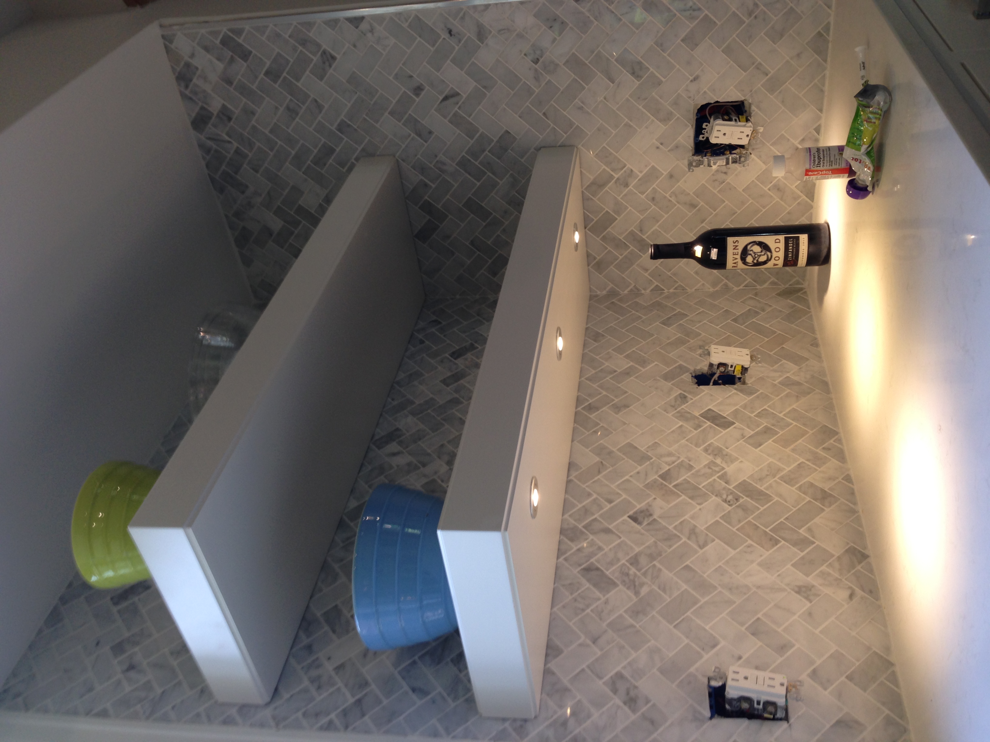
We had a solid concept in the initial planning stages & I was very happy with the way things were drawn up....However, I think that now that the finishing items are being delivered and being installed I'm even more happy about the way it will turn out. White cabinetry, white Caesarstone countertops and herringbone carrara are going to make this kitchen pop.
Here are a few progress photos...and I'm happy to say AHEAD of schedule!
The peninsula will house the 5 burner gas cooktop and downdraft. The island will now be used solely for prep surface. Previously, the island was almost unusable because the cooktop took up the entire surface.
The stainless steel farmhouse sink will provide a nice modern contrast to some rustic elements we are incorporating into the design
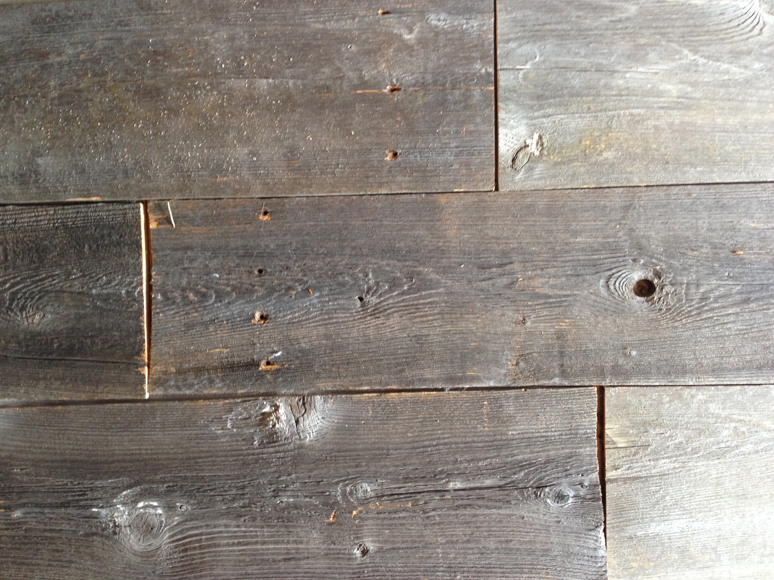
One thing that will really give this space a truly unique feel is the incorporation of some reclaimed barn wood that I found at Front Range Timber in Denver. Love those guys. They go to Wyoming and tear down old dairy farms, then repurpose the planks for projects such as ours...
Reclaimed barn wood will wrap the back of the island and the peninsula.
Here are a few pics of tile that we will be using in the space.
This amazing pattern is being installed around the fireplace surround, which is visible from the kitchen
1 x 2 Carrara Herringbone backsplash
There will be a lot of work happening in the next two weeks in this space that will dramatically transform it. I'll keep you posted!
Planning for Switches and Outlets in Your Kitchen Design
It is quite easy to overlook the placement of GFCI receptacles (outlets) and light switches in your kitchen design. We use these items so often that they become an oversight because they're always just "there" when you need them. However, somebody had to think about where to put that light switch or that GFCI outlet. It didn't just appear there...
I use a few simple guidelines for switch and outlet placement when designing my clients' spaces. Simply spending a few minutes in the design phase to lay out these items can make a big difference in the overall function of a finished space.
Outlet Specification and Placement
Have you ever heard of a "decora" style switch or receptacle but were unsure of what it meant? It refers to a line of outlets and switches manufactured by Leviton. The "rocker-style" switches and square styled receptacles look more modern and have more features than the old school style of outlets, so they are preferred by most homeowners.
Each municipality has its own requirements and codes for the placement of GFCI receptacles in the kitchen. So you'll need to ask your electrician what the exact distances are for your town. However, I can tell you that in its most general sense, you will need GFCI receptacles in the following locations in every kitchen:
- Within approximately 2 feet of the outside edge of any sink located along a wall
- On an island: one receptacle on each end of the island
- On a peninsula: one receptacle on the end of the peninsula
- On the kitchen walls: one receptacle every 2 feet (approximate. Again, check with your electrician for the exact dimensions required by your town's codes)
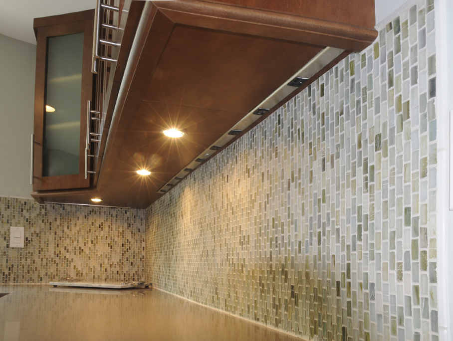
If you don't want to see GFCI receptacles in your kitchen backsplash, you can also use what's called "plug mold". Plug mold is more costly than standard outlets and more difficult to plan for and install, but it's very convenient and it completely hides your required outlets up under the wall cabinets.
Plug mold is a great alternative to standard outlets in the kitchen backsplash. There are several manufacturers of plug mold.
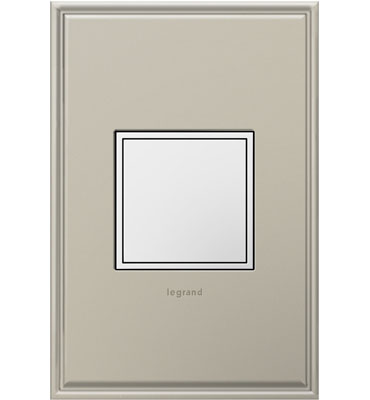
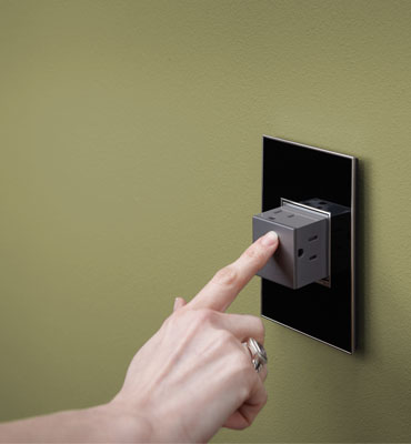
Another option I love for new kitchen outlets is the new Adorne line of receptacles and switches by Legrand.
The pop out outlet from Legrand is a great look in every kitchen
Outlets are a necessary eye-sore in every room, but most important in the kitchen. When planning your kitchen outlets, think about where you will place your small countertop appliances and where you'd like to have them plugged in. When in doubt, add an outlet.
You'll also want to think about where you'll charge your phone, tablet, and other mobile devices. When space allows, I always plan for a charging station in the kitchen. Not every kitchen has the room for it, but most do. Having a spot to charge your devices away from where food preparation occurs is a very nice thing. So don't forget to think about that aspect as well.
Switch Placement in the Kitchen
When laying out the switch placement in a kitchen, I always start by looking at the traffic patterns of the space. Most kitchens have 2 main entrances, sometimes three. I will identify those spots and locate my switches for the main ceiling lighting (most of the time it's the recessed cans) in a spot where they are easily accessed by those entrances. I almost always specify dimmers for the main can lighting.
The undercabinet lighting is usually switched somewhere in the kitchen backsplash. It is helpful to label the switches so that guests know what they're looking for when trying to turn on lights.
Accent lighting can be switched almost anywhere. (Accent lighting refers to the interior cabinet lights, or perhaps downlighting under the toekick). Just make sure you think about it before the electrician shows up and decides for himself where it should go without consulting you first!
Whisper Switch from Legrand
The main guidelines to follow are below. Sometimes, giving an unglamorous subject (such as switches and outlets) just a few minutes of thought is all it takes to really save yourself some major headaches down the road!
- Ensure that all GFCI requirements are met in your kitchen. This means you will need outlets near the sinks, on the ends of the island or peninsula, and also above any courter surface - in the wall.
- Think about what sort of receptacles you want to see. Are you OK with the old style outlets and switches? Or would you prefer to spend a little more and get some modern outlets that have a better look?
- Identify the major entrances / exits to the kitchen. Place switches for the main ceiling lighting at these locations. Use a three way switch that will allow you to operate the lights from more than one entrance for best convenience. Identify which lights should have dimmers and communicate to electrician.
- The switch placement for undercabinet or accent lighting can be placed anywhere you choose. However, ensure that you think about this prior to the work being commenced.
- Spend a little bit of time thinking about what sort of phones or tablets you might want to keep in the kitchen and where you will charge them. Do you want an exposed countertop area where your devices will be out in the open for everyone to see? Or would you prefer to hide them behind doors? Both of these options are available to you, it is really a matter of deciding which you prefer early in the design process and then planning accordingly.
A Modern Bathroom in Greenwood Village - Scouting Shots
Scouting shots from a recent bathroom remodel in Greenwood Village. Here are some of the highlights...
Cracked glass floor detail...Axor tub filler and faucets...custom Anegre veneer high polish cabinetry.
We used a really great luminescent tile for an accent in the shower. The wall tile is a 12x24 porcelain that is very similar to crema marfil marble.
Axor fixture, shown in front of the niche we built for additional storage. The storage niche is great for the homeowners' electric toothbrushes and has its own LED lighting and GFCI receptacles.
Shower niche
The free standing tub is by Hydro Systems, and the tub filler is the Axor Massaud. Striking!
7 Ways to Enjoy Your Kitchen Remodeling Experience
It's been a little over four years since I wrote, "8 Steps for a Successful Kitchen Remodel". I received a lot of positive feedback about it. That article was meant to provide a very basic look at what to expect during a kitchen (or bathroom) remodel. There is a lot of information pertaining to expectations, responsibilities, and order of events. So if you have never remodeled before - OR perhaps you just want to find out a little bit about my process, click on that link above to access that article.
This post is more geared towards providing some positive insights into how you and your family can not only survive, but ENJOY your remodeling experience. There is a misconception that every remodel has to be a stressful, drawn out process with absolutely no joy in it. And while ripping out your kitchen (or bath) can be anxiety-inducing; it shouldn't keep you up at night.
7 Ways to Enjoy Your Kitchen Remodeling Experience
1. Document everything with the idea that you will create a picture book about the experience once complete. Check out www.mypublisher.com, or you can use the iPhoto Print Services online if you are an Apple junky like me. Take detailed before pictures. Try to take photos of every conceivable angle and if you can, envision where the most dramatic view points will be when the project is complete. Taking a shot every single day isn't totally necessary, but I always take a quick photo of the major progress items, (cabinets, countertops, appliances, etc...) Take the "after" shots keeping in mind where you took your "before" shots. If you can stand in the same location-even better! Put the before/after shots side by side for a dramatic effect. This documentary of the progress of work can be really fun to look through a year or two after completion.
Well planned out temp kitchens make life much nicer for you when your real kitchen is ripped apart.
2. Plan your temporary kitchen space ahead of time. So important! Here's what you'll need:
- Cooking Appliances: For about $50-$100 you can buy a couple of electric or induction table top burners that plug into a regular outlet. In addition to your burners, set up a small microwave in a convenient location. You'll use the microwave a LOT over the next few months.
- 6 foot folding table. If you have room for two of these, even better. You'll need a surface for your table top burners, microwave, etc.
- Trash can
- Disposable dinnerware. I know it is wasteful, but you're not a terrible person if you use disposable plates and forks for a few months. There are several options that are recyclable as well. Try to minimize the dishes you have to do after your meals.
- Get a bus box from a restaurant supply store. Use it as as catch-all for dirty dishes.
3. Plan Dinners with Friends You Haven't Seen in a While. How long have you been planning to have dinner with that couple you love but haven't seen in 6 months? In fact, how many friends do you need to catch up with? If you are like me, then it's probably quite a few. What better way to get away from the construction zone AND get a free dinner than going over to your friend's house??? You'll have some fantastic conversation topics to talk about over dinner. It's OK to have an extra glass of wine too. You deserve it after living through this remodel...
4. Take Weekend Excursions. What? Go on a vacation during a remodel? Well, a lot of us can't afford to take a big vacation while simultaneously paying for a big kitchen renovation. For those of you that CAN - this is the best way to survive in style. I hear Cabo is great this time of year...But for those of us that need to be a little bit more frugal during the renovation, taking a weekend excursion to that mountain town you haven't explored is a great way to get away. Go camping, take a trip to see relatives. In short - just get out and do something that requires you to stop thinking about what type of granite you should decide on for one weekend!
5. Watch a Tradesmen Do His (or her) Work for About 30 Minutes. Most tradesmen would probably be cool with you taking an interest in their job. This tip is not for everyone. But for those of you that are interested in residential construction, it is a great way to learn something new while also getting on the good side of your subcontractors.
6. Use the Grill! The grill is still my favorite cooking surface. My family grills year round. Yep. Not uncommon to see me in boot deep snow firing up the grill in January. A) minimal clean up, B) great flavor, C) large cooking surface. Have a BBQ & tell your friends to bring a side. You can cook anything on the grill and show off the progress of your kitchen renovation to everyone.
7. Create a Time Capsule with Your Children. It's amazing what you pull out of old houses during a renovation. 50 year old newspapers, family photos, etc. Well, why not leave a little something for the next family that lives in your home and decides to remodel? Kids will probably really enjoy this exercise (unless they're teenagers, in which case they probably hate everything). Ask them to grab one or two small items or photographs. Add a current newspaper article or this month's 5280 Magazine. Stuff it all into a mason jar and maybe include a nice note wishing the next homeowners luck. You might stuff it into the new wall you're framing out or perhaps put it in the crawlspace in a corner where nobody will find it for a very long time. Either way, it will be fun for your next homeowners.
Construction Zone Shots - Traditional White Kitchen - Greenwood Village
A few shots from a job site in Greenwood Village. This spectacular home is built in a southern traditional style. It would feel right at home in North Carolina or Georgia. This kitchen has TONS of storage, seating for 5 and a full set of professional grade appliances that will be installed soon. Clients are hoping to get in before Christmas! [gallery columns="2" type="square" ids="845,844,843"]
Custom Glass Wine Enclosure with a View!
My clients asked me to design an area to store their wine inside their corner unit on the 28th floor of The Spire building, in downtown Denver. I found the wine racking system locally here in Denver. VintageView; a Denver based wine cellar company provided the interior racking system. None of their standard units were perfect for our application, so they made a custom rack for us and delivered it directly to the building. The sides of the racking system are made out of a high quality clear acrylic that is 3/4" thick. Each rod is polished stainless steel. In all, the unit weighs in at over 250lbs and is extremely sturdy. It is a free standing system that can be placed anywhere. We chose to enclose the 350 bottle capacity wine rack with a custom glass surround. 1/2" industrial grade tempered glass was used and we worked with Denver Glass Interiors to create the finished product. Not shown in this photo: LED lights are strategically placed along the floor. They shine upward - creating a really unique effect for entertaining.
I know what you're thinking - with all that light, it's really going to mess with the wine! AHH HAAA - I brought in a special commercial window tinting specialist to advise on this. As it turns out, the windows in this LEED certified building are all super Low E...meaning they block 99% of all UV rays, and a lot of the heat. Also - the patio of the unit above this apartment casts a year long shadow over the windowed area where we installed the glass enclosure. But just to be sure, the homeowners also had auto-blinds installed behind the wine rack. The blinds are operated by remote control and can be closed in any situation where directly sunlight makes its way into the apartment.
I think this wine enclosure is awesome. It was the first one I had ever designed and I think that it turned out amazing. I can easily see using this version or a modified version of it (possibly temperature controlled) in any wine enthusiast's home.
Water Jet Technology in the Bathroom
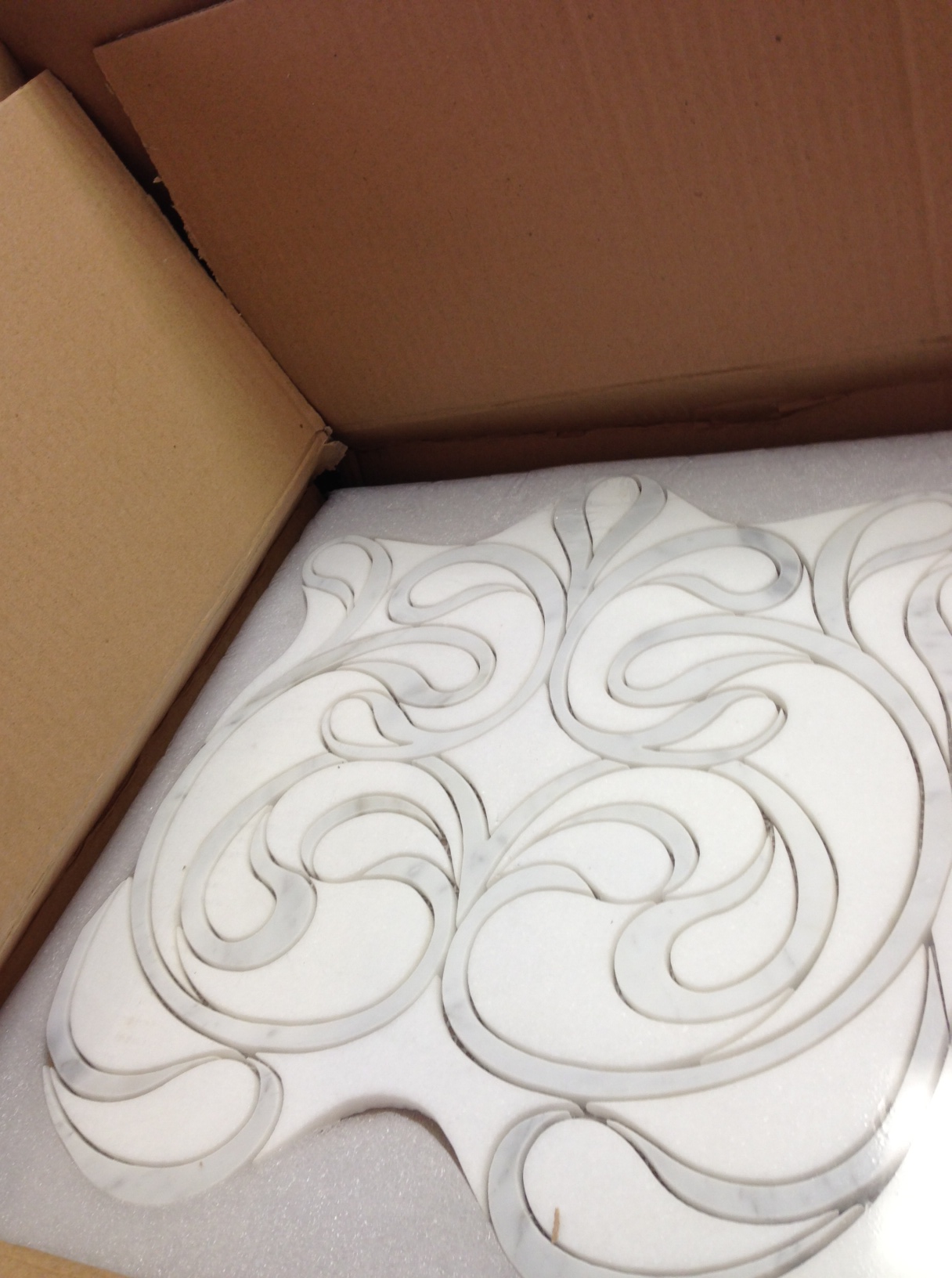
I've posted in the past that water jet technology is making its way into stone and tile manufacturing. It's allowing the manufacturers to cut really intricate designs into the stone and create some very elegant mosaic patterns. Below, a quick shot of a water jet natural stone mosaic (created out of thassos and calcutta gold marble) that I received in my office this week. We are using 8 of these beautiful mosaic tiles to create a 2' x 8' mural in a shower in Cherry Hills Village. I will post photos of the finished bathroom once we are done and include some detail shots of the mosaic as well.
Historical Remodel in Cheesman Park
My client has painstakingly restored this beautiful Denver Square over the past three years. I was fortunate enough to work with him on the kitchen and three bathrooms in this residence. We carefully planned each space to have its own unique character. I respected the history of the home as much as possible throughout the design phase. We saved items from each room and integrated them into the new design so that our new kitchen and baths had a similar feel to the rest of the home. Photography by Teri Fotheringham.
The Kitchen
Exposed brick walls in the kitchen thoughtfully contrast the stainless steel range and pro hood. It's the classic, "Old and New", theme that I like so much. Also in the kitchen, original leaded glass panes of glass were preserved from the original cabinetry and integrated into the new cabinetry. I literally designed the kitchen around these glass panes. We removed a large load bearing wall and replaced it with a 20' long steel beam to gain some much added space. The client desperately wanted an island - any island - in his kitchen. I designed a small functional island with a lot of storage in the middle of the kitchen and it even has space for two small bar stools...
[gallery type="rectangular" ids="805,804,803,802,801,800,782,781,780"]
The Bathrooms
We gutted all three bathrooms in the home, and all three now have their own unique feel and charm. The powder room is simple and sophisticated. A white porcelain vessel sink sits atop a piece of granite. The wall mounted bridge faucet adds interest. A tin ceiling, adds a bit of drama to the space.
[gallery type="square" ids="813,814"]
The Master Bathroom again utilizes an exposed brick wall. Interestingly enough, the brick wall was not part of the original design. It was covered in plaster and we had no idea it would look so stunning when we took the plaster down. However, after seeing the space with the brick exposed, it was a no brainer to just restore the brick and leave it as a statement wall in the bathroom. All the surfaces are custom concrete forms that I designed myself. An integrated planter tray, with its own drainage system is actually the same piece of concrete as the shower bench. A piece of frameless shower glass separates shower bench from planter.
[gallery type="square" ids="819,818,817"]
The upstairs hall bathroom was a different style all together. The owner wanted to provide a very sophisticated, clean, white space for his guests to use. To capture that dynamic, I utilized an antique white penny round flooring tile, and sourced a very simple white pedestal sink and free standing tub. The waincot paneling, which I also designed, has white glass center panels. The mixture of glass and wood updates the space and gives it a glamorous feel.
Installation of Beautiful Stonewood Granite
Stonewood Granite is pretty cool stuff.
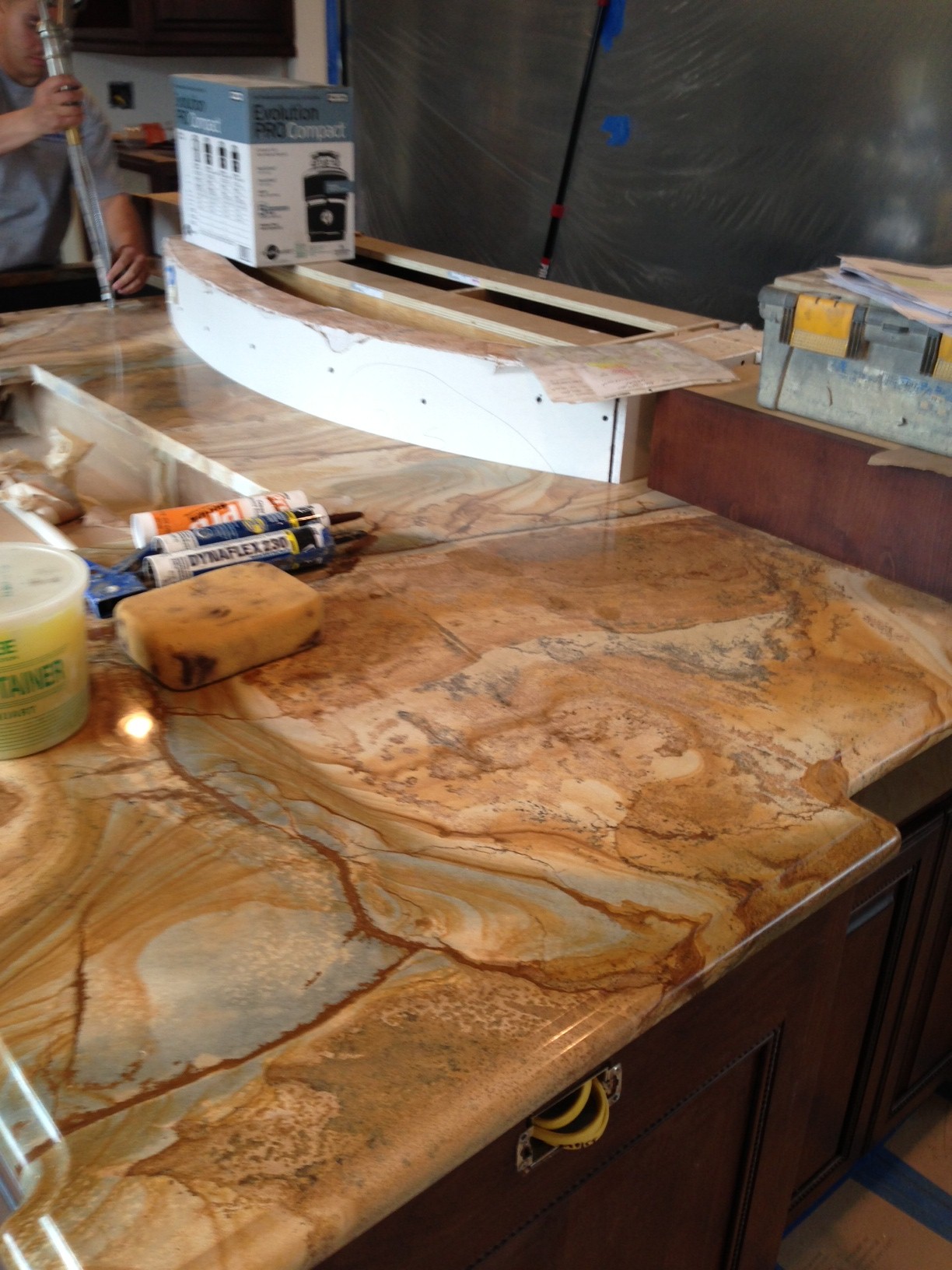
I'd never seen it before about two months ago. We found this slab at The Stone Collection in Denver. This picture is from a project in Observatory Park, Denver. The granite was installed on Tuesday....It's really striking when you see it up close. Of course, we'll get some pro shots of the finished project when it is complete.
Scouting Shots - Historic Remodel in Cheesman Park
The before and afters speak for themselves! This kitchen was tiny, dilapidated, and really poorly laid out. We removed a load bearing wall and put a steel beam in place to open up the space. The inset cabinetry is painted with a glaze & really feels like it has been there for a hundred years. Check out the leaded glass in the two wall cabinets next to the new stainless steel hood. We salvaged the glass from the original cabinetry and used it in the new cabinetry. I found hardware that matched the original cabinet hardware exactly, to keep the old feel of the home intact. The exposed brick wall looks great against the stainless steel range and hood. It was meticulously restored to original condition by a skilled mason. These are the scouting shots, so please forgive the messiness of the kitchen! I didn't have a lot of time to take the pictures. I am hoping to get some pro shots in the next month or so... [gallery type="square" ids="778,775,779,776,780,781,782"]
Transitional Bathroom Remodel - Bonnie Brae Neighborhood Denver
I always say that I strive above all else to keep the clients' vision at the heart of my design. It's a real sticking point for me. Honor that vision from start to finish. The first time I met these clients, they communicated to me how much they love the look of marble. They also wanted a space that was "transitional" in style. The new bathroom needed to be modern, yet also feel warm and inviting. The design of this bathroom begins and ends with a focus on the white carrara marble that was used not only pervasively in the shower, but also for the entire floor of the bathroom. Large 12 x 24 flooring tiles lay atop a radiant heat pad that covers all areas that are accessible by foot. Walking on this floor makes your feet happy :)

The free standing tub was built for us in Georgia and the tub filler was sourced from Portugal. Other details about this bathroom - limestone tile used on the wall behind the vanities creates a sense of drama. The wall mounted faucets are a perfect compliment to the style of the bath, and provide for very easy counter wipe downs. I utilized a 3" thick Quartz countertop in this space. More carrara on the tops would have been just too much, so I found something that played off the shape and color of the tub. The overall feel is an inviting space that is luxurious, elegant, modern, and calming.
[gallery columns="2" type="rectangular" ids="746,747,748,749,750,751,752,753"]
Dramatic Kitchen Shines in this Mountain Retreat
Every once in a while, a project comes along that is really special. Now, that's not to take away anything from any of my other remodels or new construction projects - but sometimes you are lucky enough to be part of a project in which all of the involved parties have an unquenchable thirst to build something that pushes our creative boundaries in the quest to provide a truly unique space. This house, this kitchen is definitely one of these spaces, and it shows through in every room of the house. I was hired by the interior designer on this project to provide the cabinetry design for this kitchen. We started from scratch and built something that we had never done before. I'm quite proud of the result. You'll notice that all of the cabinetry has a reflective surface in the door. I had to work with our cabinet shop to create a new door that would accept both a bronze glass panel and a cherry veneer panel in the door. It wasn't easy but we figured it out and the end result is beautiful! The Sub Zero housing is encased in a floor to ceiling column that is cladded in a natural stone. The housing itself had to be completely re-thought from our standard because of the door swings on the refrigerator, hence the 135 degree angles on the pilasters that anchor either end of the housing. Above the fridge, we placed a piece of Lumix Quartz (same as countertops). The result is a piece that mimics a work of art instead of an appliance.
If you are interested in working with any of the other professionals associated with this project (interior designer, architect, builder), please get in touch with me.
[gallery type="rectangular" columns="2" ids="714,715,716,717,718,719,720,721"]
Cherry Creek Loft - European Styled Kitchen and Bath
The Kitchen
I think that when most of us think of "modern" style, we tend to associate it with very cold spaces that are fun to look at, but seem fairly sterile and cold. Contrarily, this space is definitely modern, but also feels warm. I accomplished this feat by pairing high gloss custom color laminate wall cabinetry against a matte finish, dark cabinet below. The dark cabinetry is actually a rift cut gray oak veneer with a custom stain on it. Luxury appliances by Sub Zero and Wolf allow this sleek kitchen to perform at a very high level as a chef's preparation area. I designed a custom cabinet to house a dishwasher about 12" off of the floor. This higher placement makes using the appliance much easier. The end result is a space that doubles as both a wonderful cooking haven and a entertaining space.
[gallery columns="2" type="rectangular" ids="681,682,683,684"]
The Master Bathroom
The master retreat - as I like to call it - is just that: a retreat from the stresses of daily life. It's a very calming room when you step into it. Subtle colors on cabinetry, tile, and countertops are a nice compliment to the cool blue metallic paint used on the walls. A very nice place to start your day...or end it.
[gallery columns="2" type="rectangular" ids="689,690,691,692,693"]


