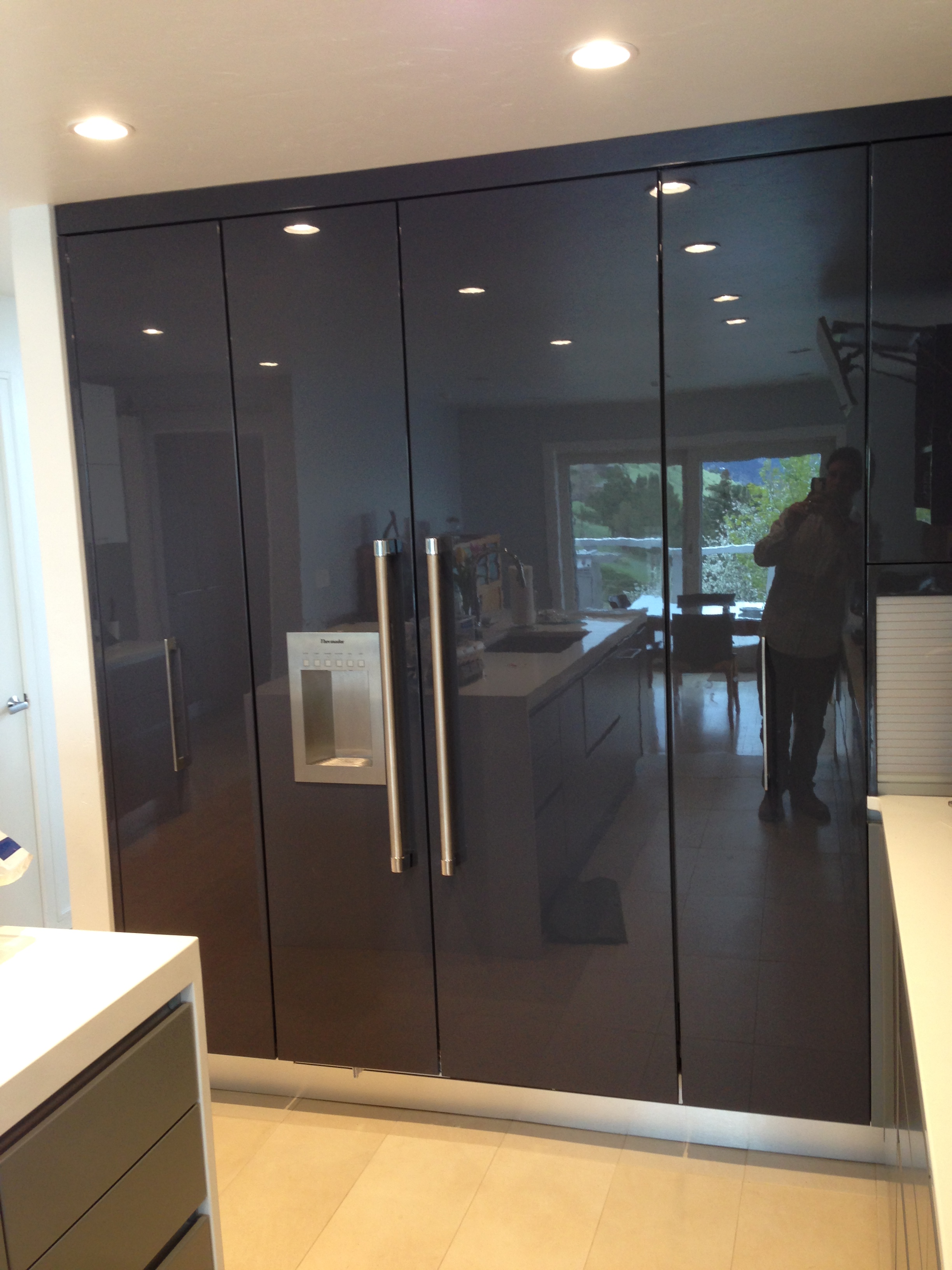
high gloss cabinetry

Following a Remodel from Start to Finish - Week 1

Interested in following one of our kitchen remodels from start to finish?  Good!  You're in luck.  We're going to be posting entries here as often as possible - shooting for weekly updates - following one of our kitchen remodels in Boulder.  

Today is the first entry - and I'm going to use a few photos and drawings to illustrate the old house footprint and what we aim to accomplish with the kitchen remodel.  

Here is a drawing of the existing house - pre - remodel.  

EXISTING FLOORPLAN

As you can see, the kitchen currently occupies the smallest room on the main level of the house.  

And while the kitchen is the smallest room on the main level, the room with the most space, the lower living room, sits mostly under-utilized.  

What we aim to do is completely relocate the kitchen down to the lower living room.  This will take advantage of the south facing windows for great sunlight, a much larger footprint, and it will also give us the opportunity to create the "great room".  Below is the proposed new floorplan for the main level:

PROPOSED NEW FLOORPLAN

And here is a 3-D rendering of what the new kitchen space will look like once completed.  A mix of zebra wood veneer and high gloss white cabinetry will be topped with a white quartz countertop and a really amazing walnut top on the island.  Sub Zero and Wolf appliances are complimented by the back painted white back splash.  We're even incorporating a new bar into the space to create a place where our homeowners can make a drink after a day at the office. 

First phase of demolition was completed yesterday. Here's our first pic of the new kitchen space, after the built ins were removed.  

Demolition phase one complete! 

Check back with our blog regularly to see the progress as we completely transform this home. We are aiming for weekly updates with photos and notes of our progress.  

Scouting Shots from a Modern Project in Boulder

This European-inspired kitchen is truly one of a kind.  The high gloss finish was actually created using the same process that car detailers use to get a reflective shine out of automobiles.  The color is called Gauntlet Gray from Sherwin Williams. We really liked it because it actually reads a bit lavender once sprayed on the cabinets.  

The high gloss cabinetry is contrasted by pure white Caesarstone countertops (Blizzard 2141) and a matte gray finish for all the base cabinets

The high gloss cabinetry is contrasted by pure white Caesarstone countertops (Blizzard 2141) and a matte gray finish for all the base cabinets

Channel construction eliminated the need for any hardware below the countertops...

Base cabinetry - metal channel construction eliminates need for hardware

Base cabinetry - metal channel construction eliminates need for hardware

So as you can see the hood is not installed and the backsplash is also yet to be installed.  Here's a picture of the tile that will be used in conjunction with a 12x36 pure white tile on the splash. 

The marble accents in this mosaic should provide some warmth and implied texture to the kitchen...

The marble accents in this mosaic should provide some warmth and implied texture to the kitchen...

I also designed some refined cabinetry for the pantry.  It's minimalistic by design and provides tons of storage for coats, cleaning supplies, cook books, and more.  

The pantry provides functional storage and keeps mops, brooms, and coats out of sight.  

The pantry provides functional storage and keeps mops, brooms, and coats out of sight.  

I specified all opaque white glass doors for the wall cabinetry.  Blum Aventos hinges provide a "wow factor" when opening and closing the cabinets.  

The lift up hinges are super silky.  

The lift up hinges are super silky.