integrated appliances

Greenwood Village Kitchen

This new home in Greenwood Village belongs to one of the nicest families I've ever met.  This kitchen is a true reflection of their style.  It is warm and inviting, but feels elegant and sophisticated at the same time.  When I first met them in 2012, they had yet to break ground on this house. Here are a few of the highlights in this kitchen:

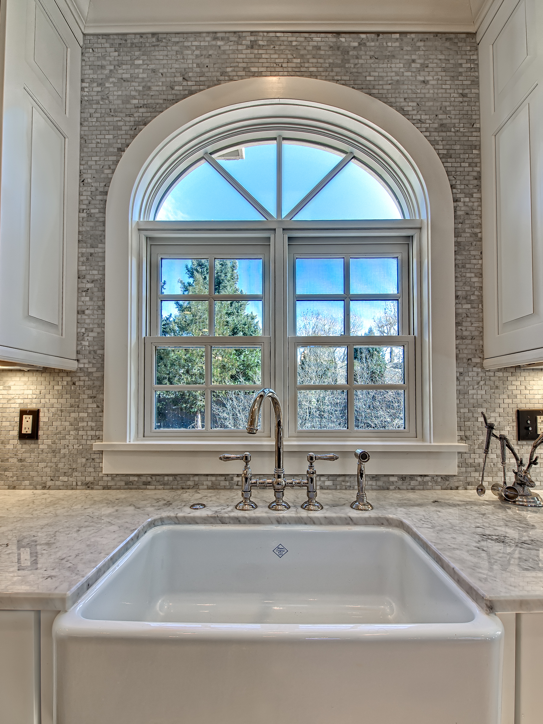
  • Originally, the sink was in the southeast corner of the kitchen.  It was in an area that I felt would become a choke point, especially for a family of 5.  I moved the sink to the East wall and added an arched window that was not previously there.

    I incorporated a traditional Rohl farmhouse sink under a new arched window for dramatic effect.

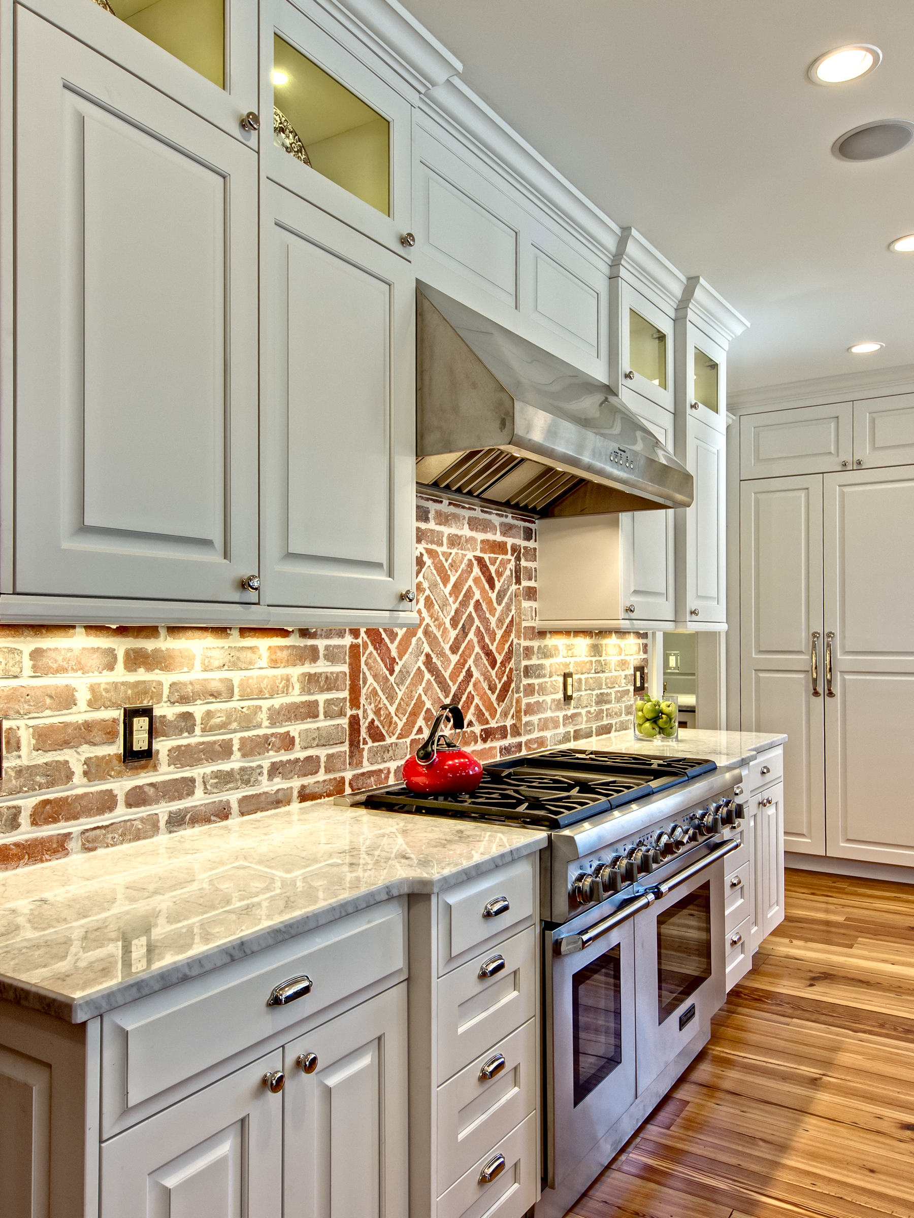
  • The North wall of the kitchen (which is the wall with all the brick) was really lacking any balance.  I moved the 48" dual fuel Thermador range onto that wall and then flanked it with symmetrical cabinetry.  All of the top boxes are individually lit with LED puck lights.

The herringbone pattern insert of bricks above the range breaks up the standard brick pattern in a way that is interesting.

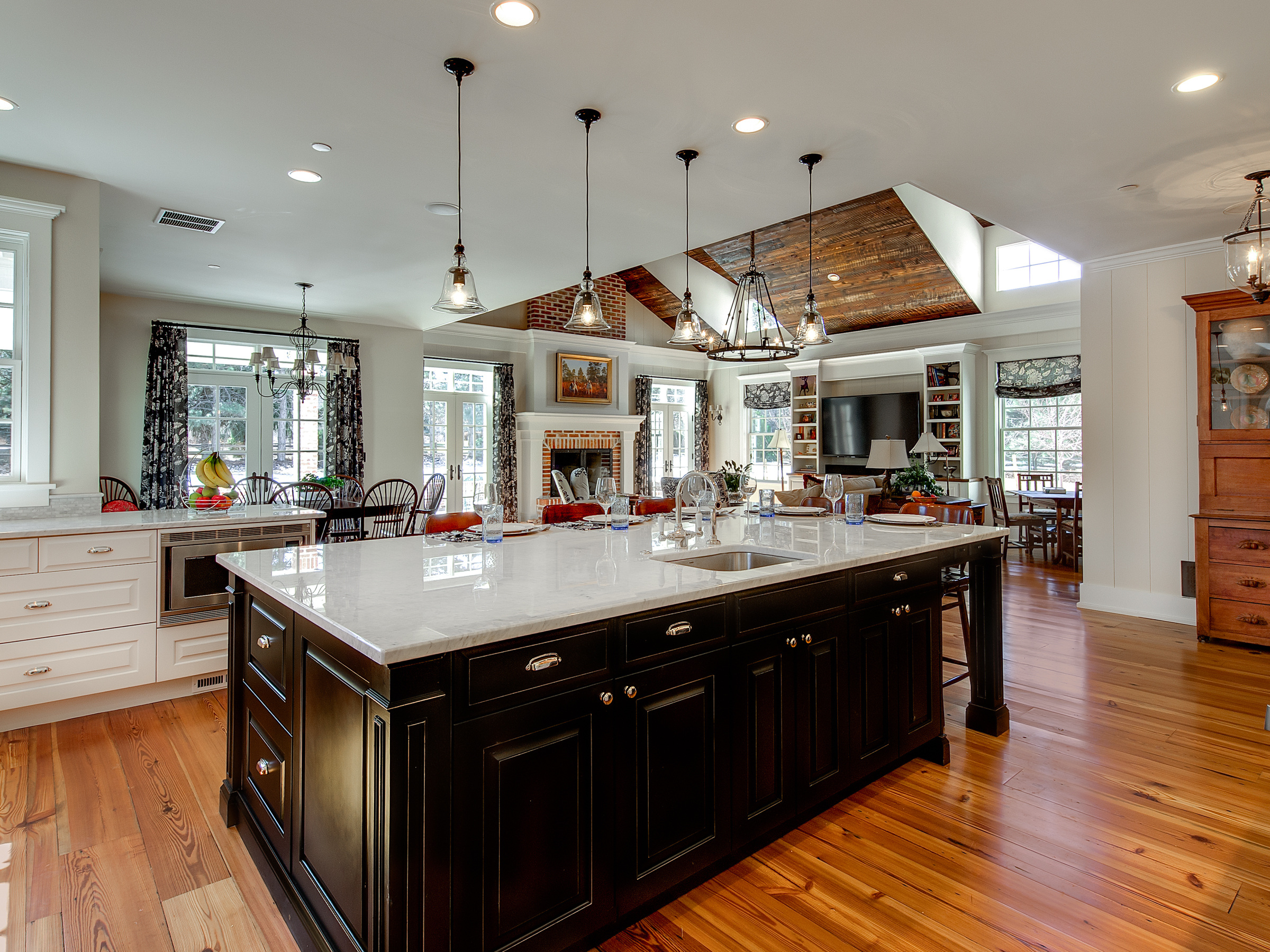
  • I contrasted the white perimeter cabinetry with a black paint rub-through finish on the island.  The implied weight of the finish provides a visual anchor for the kitchen.

Interior Intuitions Brookside. 6 Hi Res

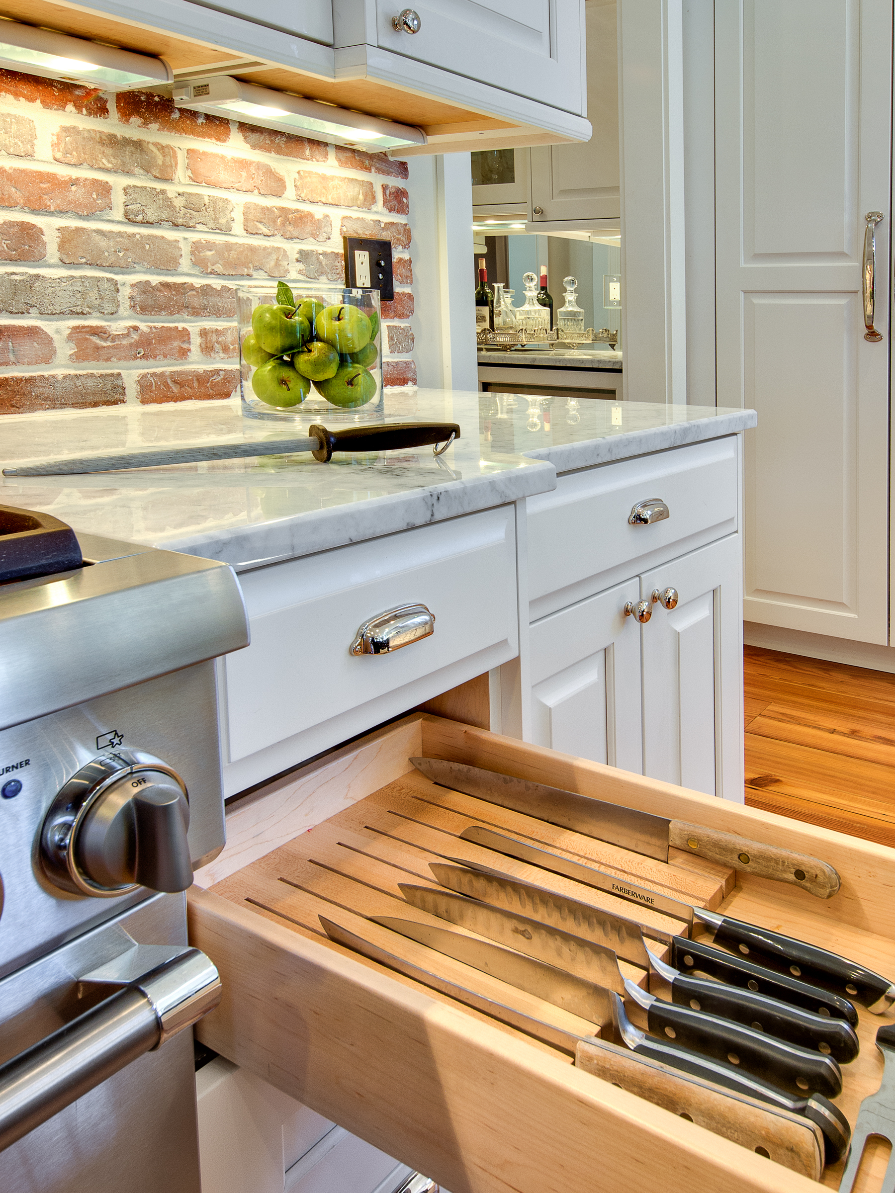
  • Lots of fantastic storage inserts...

    Knife Block

    CLICK BELOW TO SEE ALL IMAGES OF THIS PROJECT

[gallery type="rectangular" ids="889,884,891,879,882,887"]

Dramatic Kitchen Shines in this Mountain Retreat

Every once in a while, a project comes along that is really special.  Now, that's not to take away anything from any of my other remodels or new construction projects - but sometimes you are lucky enough to be part of a project in which all of the involved parties have an unquenchable thirst to build something that pushes our creative boundaries in the quest to provide a truly unique space.  This house, this kitchen is definitely one of these spaces, and it shows through in every room of the house.  I was hired by the interior designer on this project to provide the cabinetry design for this kitchen.  We started from scratch and built something that we had never done before.  I'm quite proud of the result. You'll notice that all of the cabinetry has a reflective surface in the door.  I had to work with our cabinet shop to create a new door that would accept both a bronze glass panel and a cherry veneer panel in the door.  It wasn't easy but we figured it out and the end result is beautiful!  The Sub Zero housing is encased in a floor to ceiling column that is cladded in a natural stone.  The housing itself had to be completely re-thought from our standard because of the door swings on the refrigerator, hence the 135 degree angles on the pilasters that anchor either end of the housing.  Above the fridge, we placed a piece of Lumix Quartz (same as countertops).  The result is a piece that mimics a work of art instead of an appliance.

If you are interested in working with any of the other professionals associated with this project (interior designer, architect, builder), please get in touch with me.

[gallery type="rectangular" columns="2" ids="714,715,716,717,718,719,720,721"]

Cherry Creek Loft - European Styled Kitchen and Bath

The Kitchen

I think that when most of us think of "modern" style, we tend to associate it with very cold spaces that are fun to look at, but seem fairly sterile and cold.  Contrarily, this space is definitely modern, but also feels warm.  I accomplished this feat by pairing high gloss custom color laminate wall cabinetry against a matte finish, dark cabinet below.  The dark cabinetry is actually a rift cut gray oak veneer with a custom stain on it.  Luxury appliances by Sub Zero and Wolf allow this sleek kitchen to perform at a very high level as a chef's preparation area.  I designed a custom cabinet to house a dishwasher about 12" off of the floor.  This higher placement makes using the appliance much easier.  The end result is a space that doubles as both a wonderful cooking haven and a entertaining space.

[gallery columns="2" type="rectangular" ids="681,682,683,684"]

The Master Bathroom

The master retreat - as I like to call it - is just that: a retreat from the stresses of daily life.  It's a very calming room when you step into it.  Subtle colors on cabinetry, tile, and countertops are a nice compliment to the cool blue metallic paint used on the walls.  A very nice place to start your day...or end it.

[gallery columns="2" type="rectangular" ids="689,690,691,692,693"]

12' Solid Wood Island Countertop Anchors this Kitchen

This spectacular island countertop is solid cherry wood. It measures 2-1/2" thick x 140" length x 45" width.

There are several radius details along with arcs on both ends and custom cutout for the 36" gas rangetop and integrated downdraft.  Needless to say, I spent a lot of time designing this piece and spent more than a few restless nights worrying about the details of installation and integration to the island.  Fortunately, our shop did a fantastic job creating the top and it turned out stunning.

But enough about the island countertop.

The design of this kitchen evolved over time.  We began with a standard galley kitchen and decided to open up the kitchen into the main living room, which ended up being a great idea.  There is more than enough room for two chefs to work simultaneously here and not bump into each other.  The Sub Zero armoire is 9' tall and mirrors the height of the tall pantry / microwave cabinet on the opposite side of the room.[gallery columns="2" type="rectangular" ids="669,670,671,672"]

European Styling in the Heart of Cherry Creek

I knew this kitchen would turn out wonderful when I first met the client.  She was open to exploring the options available in new materials and was more than willing to "go that extra step" with the design that took it from great to amazing.  The tall and upper cabinetry is a high gloss gray laminate and the base cabinetry is a composite rift cut white oak veneer with a custom stain on it.  This was a difficult kitchen to plan for, as we had to order the cabinetry from two different manufacturers, yet make it look seamless.  I think we accomplished this feat to perfection. These photos were taken by yours truly so the quality isn't fantastic.  We plan to professionally shoot this project in about a month though, so I'll post those photos as soon as they're available!

[gallery type="rectangular" ids="663,664,665"]

Cooking appliances:  Wolf induction cooktop, island hood, and oven/microwave.  Sub Zero refrigeration.  All integrated and all very sleek.  We raised the dishwasher in a custom cabinet to elevate it 12" higher than normal.  It is very easy to get into and out of.  That sort of configuration is not always doable and is based on the space available to us.  In this case, it worked perfectly - so why not??

The perimeter stone is quartz and the island is honed granite.  Stainless steel upstands and back-painted glass doors also add to the character.

Clean Traditional White Kitchen

These young clients preferred a throwback to traditional style when they decided to purchase and remodel an East Wash Park Bungalow.  From the very beginning, these clients were open to all sorts of ideas.  We eventually settled on a white kitchen with contrasting blue island.  The lighter colored flooring, neutral backslash, and carrera marble countertops all contribute to a very open and light feel.  Casual and refined; perfect for this growing family of four to eat dinners together or entertain guests. I teamed up with designer Megan Kane and the result is beautiful and functional.  Appliances are by Thermador: Integrated refrigeration and freezer columns, a 36" range, and built in microwave.  The bar area (not pictured) includes an ice maker and under counter beverage center.

[gallery columns="2" type="rectangular" ids="641,642,643,644,645,646"]

A Traditional Kitchen Remodel

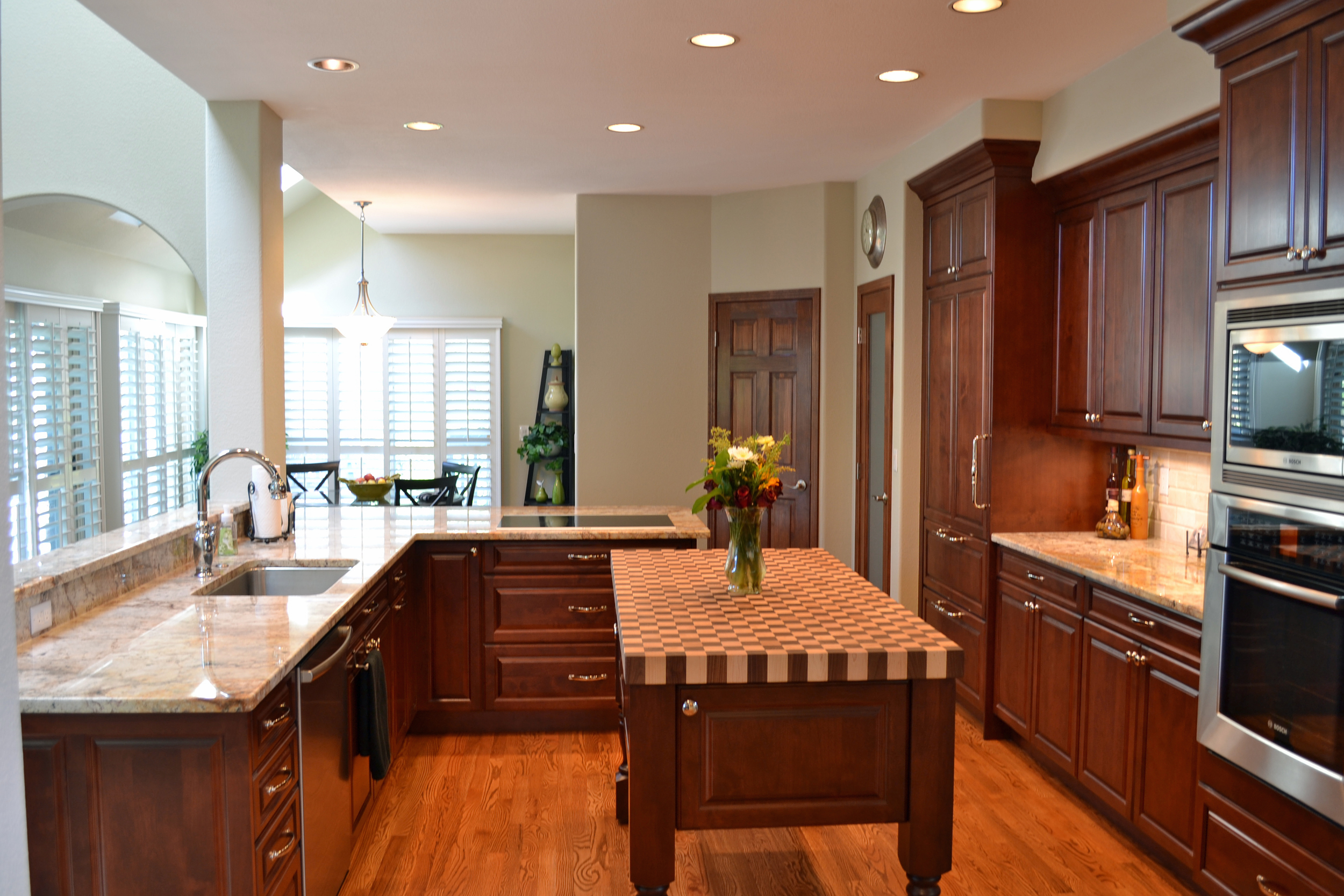
The clients, in Centennial Colorado, were interested in garnering more prep space on the countertops, updating their look, and most importantly increasing the functionality of their kitchen.  It's a difficult space!  With multiple openings, and only one true wall to work against, it was definitely a challenge coming up with a design that would satisfy all of their needs.

The old kitchen was white, builder grade.  The induction cooktop was located on the island, and their previous peninsula, to the right of the sink was desk height and awkward.  There was a serious lack of preparation space.  By stealing space from a pantry and walkway into garage, we were able to add seating for 4 people comfortably, take the cooktop off of the island, and add much needed counterspace to the back wall.  One of the biggest structural changes we made was removing a stand alone coat closet in the middle of the house.  You can see the difference it makes in the before/after pictures below.

The backsplash tile is a 3 x 6" polished limestone that we found at Decorative Materials in the Denver Design Center.  I wrote about this tile here, and it ended up being the perfect compliment to the Typhoon Bordeaux granite.

The true star of the kitchen is the 2-1/2" thick butcher block top.  It's a combination of walnut and maple, end grain.  This top was painstakingly created in Pennsylvania and shipped to Colorado, where it sits atop a mobile island.  Yes, the island is movable.  We sourced low profile casters and installed them on the bottom of each island post.  The result is a space that is truly multi-functional and very friendly for two cooks.

[gallery type="rectangular" ids="627,628,629,630,626,625,622,621,623,624"]