bathroom designer

Greenwood Village Kitchen

This new home in Greenwood Village belongs to one of the nicest families I've ever met.  This kitchen is a true reflection of their style.  It is warm and inviting, but feels elegant and sophisticated at the same time.  When I first met them in 2012, they had yet to break ground on this house. Here are a few of the highlights in this kitchen:

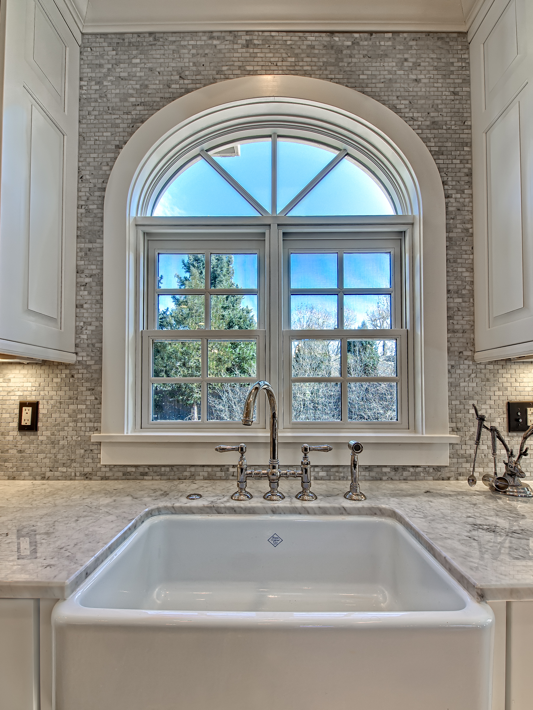
  • Originally, the sink was in the southeast corner of the kitchen.  It was in an area that I felt would become a choke point, especially for a family of 5.  I moved the sink to the East wall and added an arched window that was not previously there.

    I incorporated a traditional Rohl farmhouse sink under a new arched window for dramatic effect.

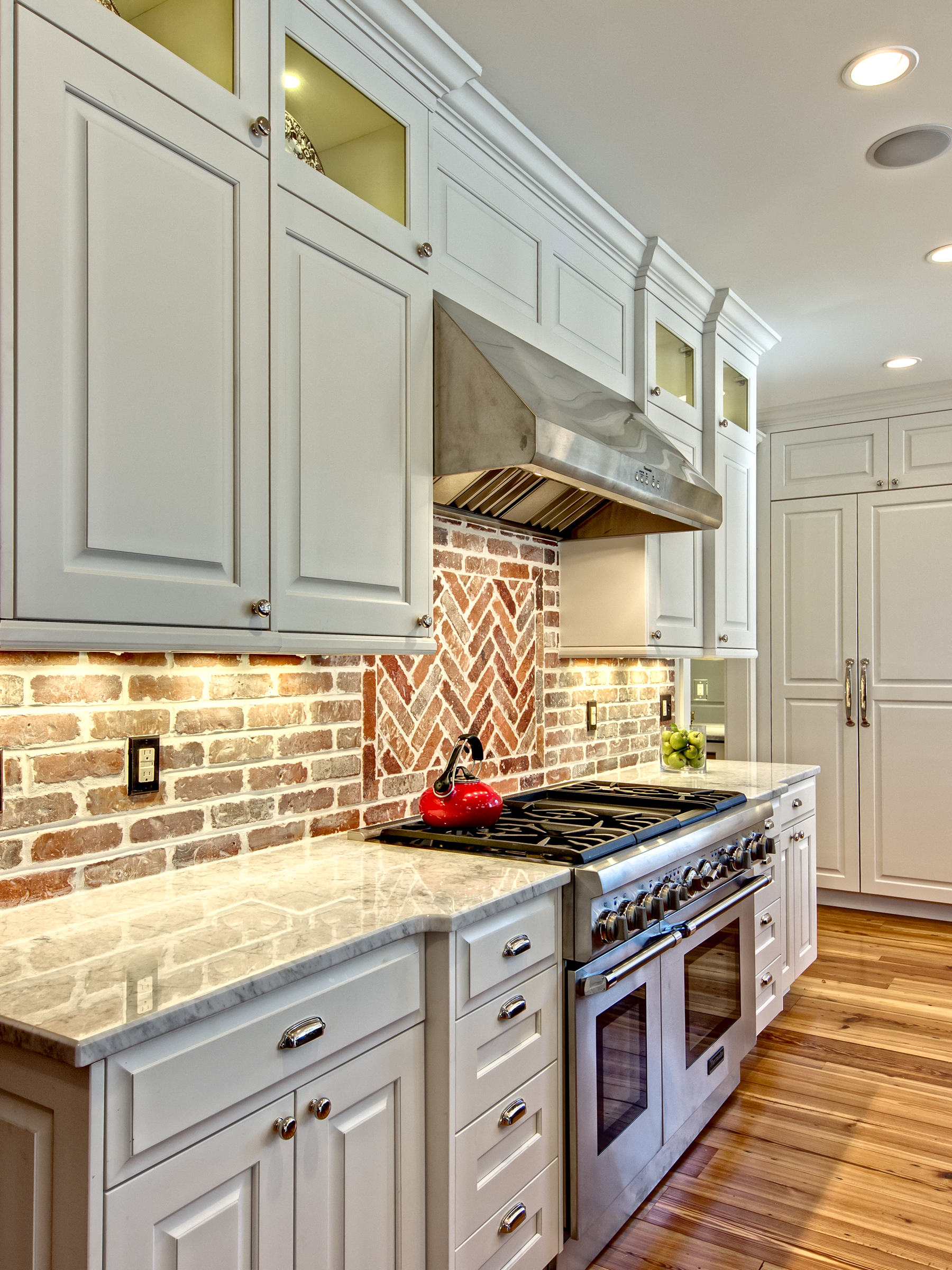
  • The North wall of the kitchen (which is the wall with all the brick) was really lacking any balance.  I moved the 48" dual fuel Thermador range onto that wall and then flanked it with symmetrical cabinetry.  All of the top boxes are individually lit with LED puck lights.

The herringbone pattern insert of bricks above the range breaks up the standard brick pattern in a way that is interesting.

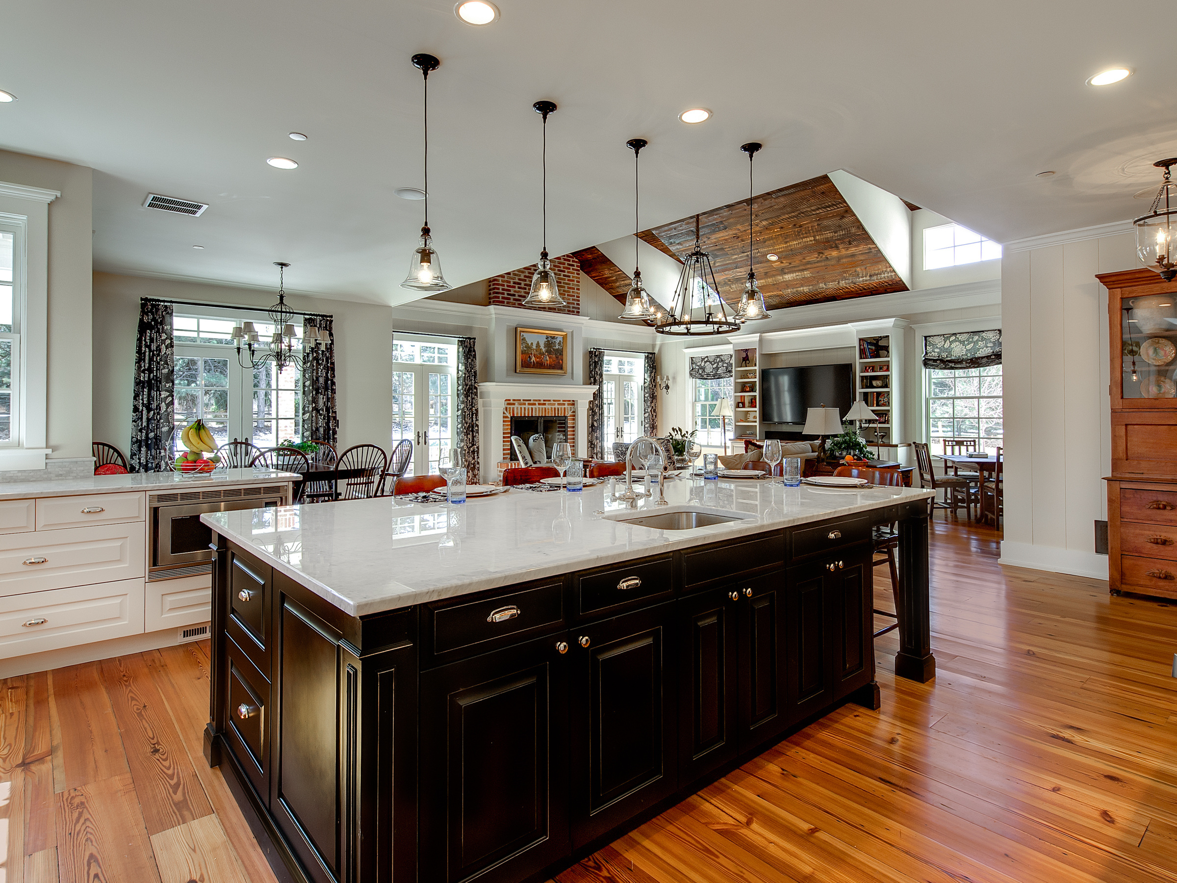
  • I contrasted the white perimeter cabinetry with a black paint rub-through finish on the island.  The implied weight of the finish provides a visual anchor for the kitchen.

Interior Intuitions Brookside. 6 Hi Res

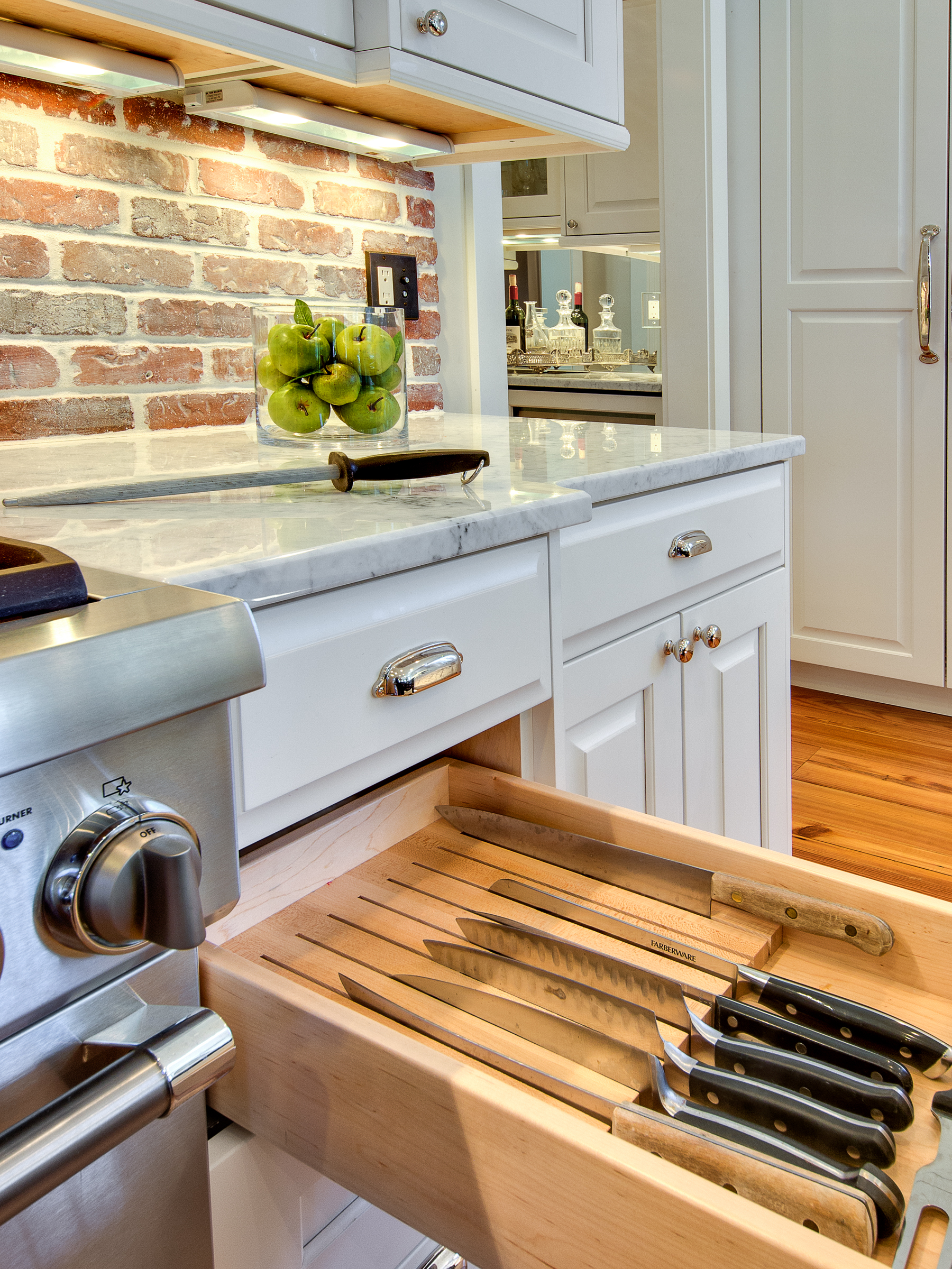
  • Lots of fantastic storage inserts...

    Knife Block

    CLICK BELOW TO SEE ALL IMAGES OF THIS PROJECT

[gallery type="rectangular" ids="889,884,891,879,882,887"]

New Kitchen and Bath Projects Fall 2013

The first snow of the year is predicted to fall this weekend.  It's only the first week of October, but after living in Colorado for almost 5 years now, it's not surprising that we will have snowy weather on Friday and sunny 70 degree weather on Sunday.  Go figure. I'm pleased to announce that I have recently been retained to work on four new projects.

A master bathroom remodel in Cherry Creek North:  We're going for a sleek transitional look.  I am specifying large format porcelain tile (18 x 36) for the flooring and a wainscot tile that is 12 x 24.  I'll tie everything together with and carrara accents, and then add some interest with vibrant colors on the walls.   The new frameless European shower will be a vast improvement.

Just up the street from the master bathroom remodel is a house owned by a couple with a young child.  It's a wonderful old house that has a newer addition on the back of it.  Problem is that the new part of the house does not tie into the old part.  There are several areas I am working on in this project including, the master suite, kitchen, great room, mudroom, entry way, and flooring.  The homeowners are very involved with the process and are excited about bringing this wonderful house together into one cohesive home.

You may have seen pictures on this blog of a classic home restoration project that I completed about a year ago...That homeowner referred me to his neighbor just down the street, and we are now currently in the design phase on her master bathroom.  Her home is very traditional, with clean lines.  I plan to give her a new bathroom that is really beautiful - but most importantly, it is going to feel like it belongs in the house.

I was also hired on to a kitchen remodel project up in Boulder.  Fortunately, this couple avoided any major flood damage - many of their neighbors are still recovering.  We're going to update their kitchen to something totally sleek and modern.  High gloss lacquer, white glass, textured laminates and quartz counters are going to make this space really POP.

We are also finishing up installation of new construction in Greenwood Village.  That project should be complete by Thanksgiving.

I will report back with pictures soon!


Central Park West in Cherry Creek

This apartment located in the Cherry Creek neighborhood of Denver could very easily be transported to New York's Upper West Side and feel right at home.  My client wanted something small and elegant, but still functional.  I was hired to design the kitchen, hall and butler's pantry, master bathroom, and one guest bathroom. I employed a pure white cabinet scheme in all the spaces for a dramatic contrast vs. the dark ebony floors.  Glass, white marble, and polished nickel hardware are used throughout the entire apartment.

[gallery type="square" ids="759,760,761,762,763,764,765,766,767"]

Transitional Bathroom Remodel - Bonnie Brae Neighborhood Denver

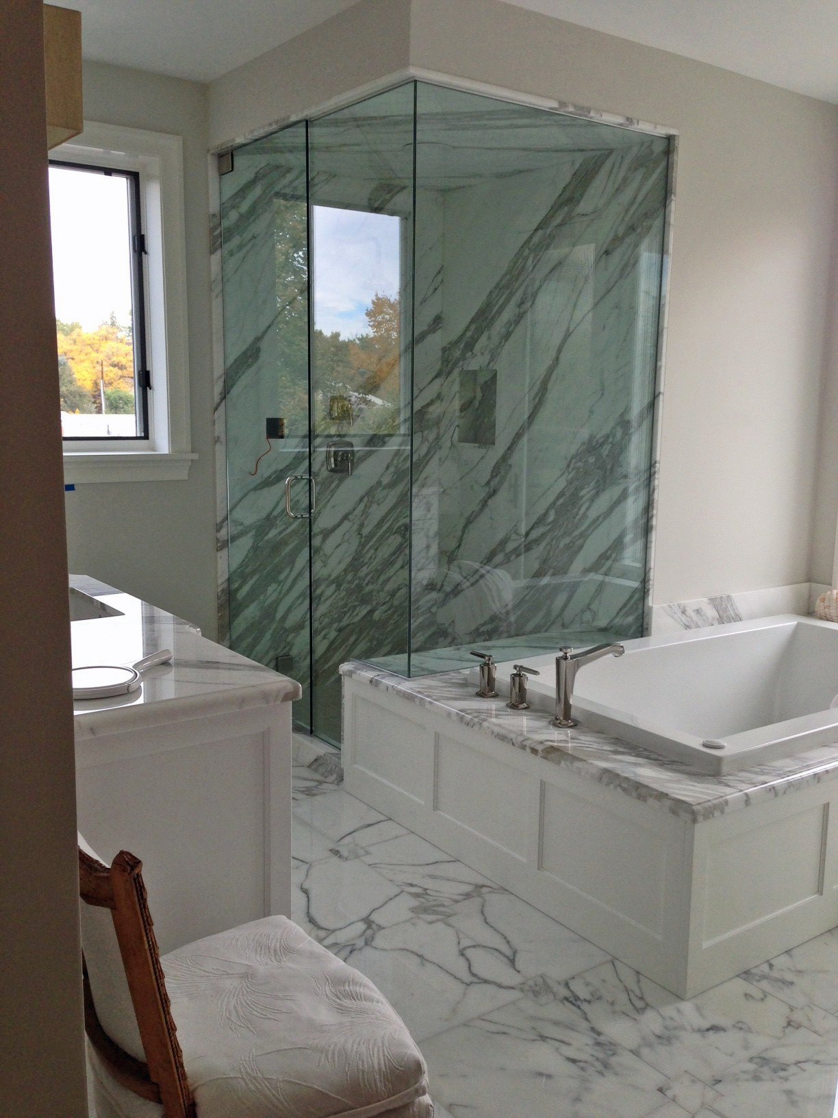
I always say that I strive above all else to keep the clients' vision at the heart of my design.  It's a real sticking point for me.  Honor that vision from start to finish.  The first time I met these clients, they communicated to me how much they love the look of marble.  They also wanted a space that was "transitional" in style.  The new bathroom needed to be modern, yet also feel warm and inviting.  The design of this bathroom begins and ends with a focus on the white carrara marble that was used not only pervasively in the shower, but also for the entire floor of the bathroom.  Large 12 x 24 flooring tiles lay atop a radiant heat pad that covers all areas that are accessible by foot.  Walking on this floor makes your feet happy :) Carrara marble slabs are the first thing the eye picks up upon entering the room.

The free standing tub was built for us in Georgia and the tub filler was sourced from Portugal.  Other details about this bathroom - limestone tile used on the wall behind the vanities creates a sense of drama.  The wall mounted faucets are a perfect compliment to the style of the bath, and provide for very easy counter wipe downs.  I utilized a 3" thick Quartz countertop in this space.  More carrara on the tops would have been just too much, so I found something that played off the shape and color of the tub.  The overall feel is an inviting space that is luxurious, elegant, modern, and calming.

[gallery columns="2" type="rectangular" ids="746,747,748,749,750,751,752,753"]

Dramatic Kitchen Shines in this Mountain Retreat

Every once in a while, a project comes along that is really special.  Now, that's not to take away anything from any of my other remodels or new construction projects - but sometimes you are lucky enough to be part of a project in which all of the involved parties have an unquenchable thirst to build something that pushes our creative boundaries in the quest to provide a truly unique space.  This house, this kitchen is definitely one of these spaces, and it shows through in every room of the house.  I was hired by the interior designer on this project to provide the cabinetry design for this kitchen.  We started from scratch and built something that we had never done before.  I'm quite proud of the result. You'll notice that all of the cabinetry has a reflective surface in the door.  I had to work with our cabinet shop to create a new door that would accept both a bronze glass panel and a cherry veneer panel in the door.  It wasn't easy but we figured it out and the end result is beautiful!  The Sub Zero housing is encased in a floor to ceiling column that is cladded in a natural stone.  The housing itself had to be completely re-thought from our standard because of the door swings on the refrigerator, hence the 135 degree angles on the pilasters that anchor either end of the housing.  Above the fridge, we placed a piece of Lumix Quartz (same as countertops).  The result is a piece that mimics a work of art instead of an appliance.

If you are interested in working with any of the other professionals associated with this project (interior designer, architect, builder), please get in touch with me.

[gallery type="rectangular" columns="2" ids="714,715,716,717,718,719,720,721"]

Cherry Creek Loft - European Styled Kitchen and Bath

The Kitchen

I think that when most of us think of "modern" style, we tend to associate it with very cold spaces that are fun to look at, but seem fairly sterile and cold.  Contrarily, this space is definitely modern, but also feels warm.  I accomplished this feat by pairing high gloss custom color laminate wall cabinetry against a matte finish, dark cabinet below.  The dark cabinetry is actually a rift cut gray oak veneer with a custom stain on it.  Luxury appliances by Sub Zero and Wolf allow this sleek kitchen to perform at a very high level as a chef's preparation area.  I designed a custom cabinet to house a dishwasher about 12" off of the floor.  This higher placement makes using the appliance much easier.  The end result is a space that doubles as both a wonderful cooking haven and a entertaining space.

[gallery columns="2" type="rectangular" ids="681,682,683,684"]

The Master Bathroom

The master retreat - as I like to call it - is just that: a retreat from the stresses of daily life.  It's a very calming room when you step into it.  Subtle colors on cabinetry, tile, and countertops are a nice compliment to the cool blue metallic paint used on the walls.  A very nice place to start your day...or end it.

[gallery columns="2" type="rectangular" ids="689,690,691,692,693"]

Classic White Kitchen - Observatory Park, Denver

Believe it or not, I started working with this client in the summer of 2011, and today is March 27, 2012 - which means I've waited a long time to see this project come together - I think it's going to be worth the wait. This is new construction in the Observatory Park neighborhood of Denver.  The house would feel right at home in any cozy New England town (New Canaan?) , so we took great care to make sure the kitchen and other rooms (we are installing cabinetry in 11 rooms in this home) had the feel of an updated colonial classic that would fit right into any New England colonial.  The pure white paint in the kitchen makes the space really light and airy.  The floors will eventually be stained dark, so there will be a very dramatic contrast there between floor and cabinet.  This classic kitchen will really be fantastic when complete...

Here are a few installation pics of the kitchen.  I'll update when I have some better finished pictures.

[slideshow]